What, exactly, is the ITDP's agenda, and why do they fight mode wars? They denigrate rail-based transit as if their opponents were well-funded machines slowly tracking over the world. In fact, LightRailNow.com, their "opponent" in the silly mode wars, is a small outfit in Austin which was originally founded to encourage light rail in that city, and doesn't have the same funding or, agenda, it seems, that the ITDP does.
The ITDP says that its field of expertise is "Public Transport" but have a very narrow view of public transport: anything that doesn't run on rubber wheels in a right of way doesn't really count. This is really an open question: what is their agenda? Why not focus on better transit regardless of mode? Why publish reports with unsubstantiated statistics that don't stand up to the light of day? Wouldn't their argument be stronger if they reported the facts of BRT, and didn't make up numbers?
As I've said before, I agree with a lot of what they say about the utility of bus rapid transit, but with one major difference. Bus rapid transit is an important part of moving people more efficiently, but only part of it. Buses, light rail and heavy rail transit each have their place, and need to be used where they are most appropriate. In a city like Bogotá, with wide boulevards and lower operating costs, BRT makes sense. In a city like Mexico, with gaps in a good rail network and relatively wide street, it does as well. In Cleveland, the HealthLine was likely a good investment in that corridor to spur development along the Euclid corridor. In Boston, BRT is certainly a good choice in some corridors. But, as I'll flesh out in a final post in this series (yes, all things, good or otherwise, must come to an end), trying to shoehorn it in to certain corridors just doesn't make sense.
I'd go as far as to say that the ITDP doesn't really care about public transportation. They care about their bottom line. They want cities and foundations to pay them money to write reports using the metric they made up to analyze what they want to analyze. Good work, if you can get it.
Thursday, June 25, 2015
Perhaps we should look north?
What is the best analog for the future of transit in the US? If you ask the ITDP, they point south: Mexico, Colombia, Brazil, countries which have invested heavily in bus rapid transit. It's a rather curious comparison for a couple of reasons. First, those countries have much lower standards of living than the US does, so that operating costs for high-personnel transportation systems (buses require five to ten times as many drivers as trains) have a lower cost. Another is the streetscapes: many South American cities have Haussmann-style boulevards with plenty of room for BRT systems which are wide enough to support high-capacity systems. We don't have that in the US. There is also a climate question. Countries with no freeze-thaw cycle can more easily build asphalt and concrete busways and expect them to last, while in the US, they require more preventative maintenance.
So perhaps the best place to look is not to our south, but to our north. That's right. Canada. Unlike the US, no city in Canada had a pre-war subway system. When demand outstripped street supply, Canadian cities have taken a number of different tacks towards addressing transit needs:
Canadian cities have generally been successful in getting people to commute without driving, much moreso than in the US. Even in the Texas of Canada (Alberta), half the commuters to Downtown Calgary take transit to work (and Calgary does not have many large peripheral office parks; development is focused downtown). Bus rapid transit has worked in Ottawa, but congestion, especially in the downtown area, has caused the system to be replaced with light rail. While the outer portions work with buses, where many routes merge and streets get narrower (and Ottawa has a grid street system downtown with relatively wide roads) it has been overwhelmed.
So, back to Boston, a city which is more similar to Canadian cities than it is to, say, Mexico or Curitiba. Canadian cities have somewhat similar development patterns, highways (Montreal and Toronto both have highways serving downtown and terrible traffic, does that sound similar?) and standards of living. The ITDP chooses analog cities of Cleveland, Mexico City and Belo Horizonte in Brazil. These are examples of cities which have bus rapid transit. I'm just not sure how well they compare to Boston.
So perhaps the best place to look is not to our south, but to our north. That's right. Canada. Unlike the US, no city in Canada had a pre-war subway system. When demand outstripped street supply, Canadian cities have taken a number of different tacks towards addressing transit needs:
- Montreal's looked to Paris and its Metro system is today the third busiest metro system in North America, with more than a million passengers daily, more than all but Mexico City and New York. It's bus system carries another million and a half passengers.
- Toronto's Rapid Transit system also carries more than a million passengers per day, and is supplemented by the city's extensive surface network, which carries nearly two million more passengers, and Go Transit commuter services, which launched only in the 1960s and carries nearly 300,000 passengers, and is being upgrade to electrified service to provide faster and more frequent trains. All told, Toronto has nearly 3 million daily riders, and TTC's 73% farebox recovery ratio is the highest of any system in Canada or the US.
- Ottawa's OCTranspo carries more than half a million passengers daily, nearly all of them on buses. Many of these buses use mostly-grade-separated transitways and Ottawa is the only city in the ITDP's database (scoring bronze status). Yet Ottawa is working to convert most of it's bus rapid transit to light rail. Why? Capacity. The downtown segment, with 100 mostly 60-foot buses per hour, is oversubscribed. Even the ITDP admits it (although their circular logic is that this just points to the success of BRT, although they don't give any solution for increasing capacity).
- Calgary and Edmonton both have light rail systems. Calgary's is very well patronized, with more than 300,000 daily passengers using a single downtown trunk line, and illustrates that surface-running light rail can far exceed bus capacities in a limited corridor (including double the capacity that the ITDP quotes for light rail). Calgary's system is now the most heavily-used light rail system in North America (yes, more than the Green Line in Boston) and both systems are expanding.
- Vancouver hosts Canada's newest rail system, Skytrain, a "light metro" system which is fully grade-separated but has slightly less capacity than a full metro. Most of Skytrain is above-grade, although several sections are in tunnels as well. Notably, it is fully automated, reducing operation costs further. The city has several very busy bus routes (particularly the 99 to UBC) which are planned to be replaced by Skytrain lines in the future.
Canadian cities have generally been successful in getting people to commute without driving, much moreso than in the US. Even in the Texas of Canada (Alberta), half the commuters to Downtown Calgary take transit to work (and Calgary does not have many large peripheral office parks; development is focused downtown). Bus rapid transit has worked in Ottawa, but congestion, especially in the downtown area, has caused the system to be replaced with light rail. While the outer portions work with buses, where many routes merge and streets get narrower (and Ottawa has a grid street system downtown with relatively wide roads) it has been overwhelmed.
So, back to Boston, a city which is more similar to Canadian cities than it is to, say, Mexico or Curitiba. Canadian cities have somewhat similar development patterns, highways (Montreal and Toronto both have highways serving downtown and terrible traffic, does that sound similar?) and standards of living. The ITDP chooses analog cities of Cleveland, Mexico City and Belo Horizonte in Brazil. These are examples of cities which have bus rapid transit. I'm just not sure how well they compare to Boston.
Wednesday, June 24, 2015
Randall O'TOOLe and my response
You know your blog has made it when Randall O'Toole writes an incomprehensible critique. Which he did after reading, apparently, a couple of sentences of this blog. I commented on his blog, so read that over there.
Tuesday, June 23, 2015
How much does BRT cost? 7X less than LRT? (Hint: No.)
This is the third in a series about the ITDP bus rapid transit report for Boston, and the ITDP standard in general.
One of the claims often made by BRT propagandists is that constructing bus rapid transit is seven times cheaper than light rail transit.
This is from the executive summary of the ITDP's Boston BRT report:
If this seven-times-as-expensive figure were the case—especially in corridors where demand is not likely to exceed 2500 passengers per hour—then it would make a lot of sense to build, right? If you can get 25 miles of BRT for the price of four miles of light rail, it's a no-brainer. But what about if you can get nine miles of BRT for the price of four miles of light rail? Because that's the actual ratio: light rail comes in at slightly more than twice the cost. And the while the ITDP bandies about that number, they cite no actual evidence to back it up.
Given the capacity constraints of bus rapid transit, it becomes a harder choice: if you spend half the cost of light rail on a bus system that doesn't have the capacity to serve the needs of the corridor, it's wasted money. It becomes a sort of Yogi Berra white elephant: no one goes there anymore, it's too crowded. Crowds seem like success, and they are, to a point. But overcrowded transit runs more slowly and is more prone to uneven headways. In other words, if you build it, and they come, then what?
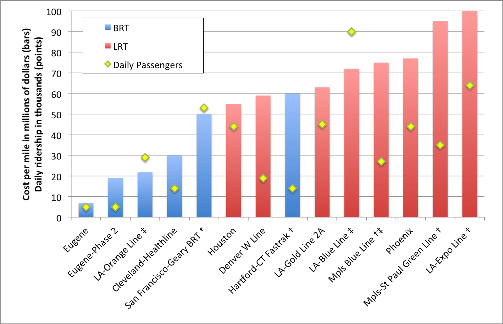
I like charts (you'll know that if you're a frequent reader) and here is one. It shows the costs per mile, and daily ridership, for a variety of BRT and LRT projects which have been built recently. I included several Los Angeles LRT examples because it is the only city which has built both BRT (to the level of an ITDP standard) and LRT in that time, and included the much older (relatively) Blue Line because it was mostly built on an old Pacific Electric right-of-way, much like the BRT Orange Line. Is light rail more expensive to construct than bus rapid transit? Yes. Is it seven times more expensive? Certainly not. The distance-weighted average construction cost for light rail is about 225% higher than BRT, less than a third of the difference that the ITDP suggests. (I've left out rail examples here—the Central Link in Seattle, for example—which include significant tunneling or grade separation, and similar BRT systems.)
There is only one example of BRT construction which is seven times less expensive than any similar light rail line: the Emerald Express in Eugene, Oregon.
Eugene, Oregon The Emerald Express was cheap to build: but you get what you pay for. The line serves a transit system which has a daily ridership of 40,000; fewer than most of the light rail lines above. It runs every ten minutes—frequent by the standards of a small town—but will require significant more investment to go any faster. Why? Because many of its exclusive lanes are bidirectional: a bus may have to wait for a vehicle going the other way to clear. It's like a single-track railroad with passing loops for buses. And the stations are not what you'd see in Bogota: here is one along a less populated stretch of the route. This is not to say that there's anything wrong with the Emerald Express—it is good for the community it serves. But that type of infrastructure would be overwhelmed on opening day in Boston.
Oh, also: the second leg of the Emerald Express—with similar BRT features—is coming in a bit higher: $19 million per mile. So the one-seventh number? It's pretty selective.
Los Angeles Then there's the Orange Line in LA. It is certainly successful, relative to an unused corridor, anyway. It runs every four minutes and carries 30,000 passengers per day. It's basically at capacity. It cost $27 million per mile to build initially (but the recent extension was more than $50 million per mile), and has a third the capacity of the Blue Line, built in a similar corridor. It wasn't built as light rail because, well, it's along story that includes Orthodox Jews and corrupt politicians. You can't make this up. Since it's over capacity, there are initial plans to improve capacity (costing another $20 million per mile) or convert it to rail ($65 to $95 per mile).
The cost for a bus line that will perform anywhere near the level of a rail line will wind up being just about as high, and will still have a much lower capacity—certainly nowhere near the 90,000 passengers the Blue Line carries. Of course, there's a sunk cost issue. Having already spent $600 million on a busway, there's an argument not to "throw this money away". But the total cost for the busway could come to $1 billion by the time all is said and done, about what light rail would have cost in the first place, with a lower overall capacity. So the BRT is really a white elephant, even if it's one that transports a lot of people. This is a perfect illustration of the problem I posited above: you spend a lot of money on a project and quickly it is overburdened.
Cleveland Perhaps the best example of a successful BRT line in the US is the HealthLine. It was built along six miles of Euclid Avenue from downtown east towards a university/hospital cluster (including, yes, the eponymous Cleveland Clinic, and Case Western, too). It carries about 14,000 passengers per day, and does so in a well-designed corridor (the only one in the US to qualify as Silver based on the ITDP's standards). The corridor varies between about 70 and 90 feed wide. The cost? $30 million per mile. It was probably a good investment. There is a roughly parallel heavy rail line that makes the end-to-end trip faster, so there's never likely to be very heavy corridor ridership, and it likely won't have to scale beyond it's single-lane capacity. Of course, this rail line has plenty of capacity (it is by far most lightly used metro system in the country) between the HealthLine's endpoints, so there is a valid question as to whether these investments were necessary.
BRT boosters (ITDP) point out that the HealthLine has been the $5.8 billion of development which has taken place along the line. (Well, other sources put the number in the $4 billion range; it's a big number.) Which is great. But two important caveats. First: correlation does not imply causation. Much of this development was planned out well before the line was built. Much of it likely would have taken place if no improvements had been made. It's not like the Cleveland Clinic (with 1500 beds and $9 billion in annual revenue) waited for the bus line out front to be built. Or that Case Western—with a $2 billion endowment—didn't spend any of it until the HealthLine was completed.
The comments by Coolebra in this article flesh this out very well, as does this article. As one commenter there quips:
Second: most of the improvements have taken place on the eastern end of the line. This happens to be where it mostly parallels the aforementioned Red Line rail line. Saying that all of the development in the area occurred because of the HealthLine would be like ascribing all of the development between Dudley Square and the Financial District in Boston to the Silver Line. It helps, but there are a couple other factors—and rail lines—involved.
So there's nothing wrong with the HealthLine, per se. It is a decent investment and has room to grow. But there needs to be a bit more nuance in analyzing it's ability to leverage private investment than claiming that anything built within a stone's throw—a college campus and two major hospitals—is only there because of the BRT. (In fact, they're there because of transit—originally, Euclid Avenue had a streetcar, of course.)
Hartford Very recently-opened is CTFastrak in between Hartford and New Britain. Like the HealthLine, it probably doesn't have the capacity needs for a rail line, and there's no existing light rail infrastructure in Hartford to build upon. It's reasonably fast, mostly grade-separated, and serves both buses along the line and others that enter the line part way along it. (It's brand new, but has been getting good reviews.) Of course, it cost $60 million per mile to build, which is comparable to most new light rail lines. It will probably score well when the ITDP comes to town (separate platforms, some passing lanes, etc) and they'll probably gloss over the fact that it cost as much as a couple of sets of railroad tracks.
It might be a good time to point out another hidden BRT cost: maintenance facilities. Light rail costs almost always include the operating fleet as well as the cost of maintenance facilities. Most BRT systems makes use of existing maintenance infrastructure, at least to start, which reduces costs in the short run but in the long run will require more or larger garages to be built down the road, especially if the line is successful (the cost of the vehicles is usually included in the cost of the system). I don't believe BRT costs have future maintenance facility requirements amortized in to their figures. Since these are likely shared with other bus operations, the costs won't be factored in to the cost of the system. Such facilities can cost more than half a million dollars per bus, adding a million dollars per mile in costs for frequent systems.
San Francisco And then there's Geary, one of the busiest bus lines in the country. It has more than 50,000 daily passengers spread out among four routes, the 38, the 38R (a limited stop route) and two rush-hour express routes, the 38AX and 38BX, which serve an outer portion of the line before using other streets to access downtown San Francisco. In a sense, these already function as a local-express BRT network, just without the bus lanes, stations and other amenities the ITDP looks for. So basically BRT, without the R. Do they function well? Hard to say. People seem to like the limited and express options (I mapped their Yelp scores a few years back) although at rush hour the 38R, which comes every four minutes, is at or near capacity (running 60 foot buses).
The city is planning to build BRT and have it "light rail ready" because they don't have the money for light rail. The problem is that this is going to have the capacity issues that the Orange Line has in Los Angeles on day one. Yes, better platforms, signal priority and wider doors may help, but the system already carries more than 3,000 passengers per hour, so it won't have the capacity in a two lane system. Much of it is being built as side lanes instead of in a center median, especially in the inner part of the route, so limited buses will be able to pass locals in mixed traffic lanes. But it won't really solve the capacity crunch, especially if there's traffic in those lanes.
There are two ways to add enough capacity on Geary. One would be to build light rail. A three-car light rail train every five minutes would carry 6000 people per hour and not be at capacity. The second would be to build a full-on four-lane Bogotá-style BRT system. The corridor already has local, limited and express buses: at rush hour, there are nearly 60 buses per hour serving the corridor. This would allow buses with different service patterns to skip stops easily, and as we've said before, a multi-lane system does have capacity that will match light rail.
There are only two issues. The first is that even the half-baked BRT system will cost $50 million per mile (and run in to the same white elephant/sunk cost issue as LA has). A four-lane system would likely cost more, getting in to the range of the average light rail system. The second is that while there is enough space on the street for this type of system, there's not much to spare. Geary is about 100 feet wide—one of the widest streets in San Francisco—but it is still narrow compared to most streets in Bogotá. Since most highways in the City were never built (or removed) and these few rider surface streets, it functions as a thoroughfare, as well as a shopping street. So to take four lanes plus stops for a busway would leave only 35 feet or so on each side, barely enough for one lane and parking. This likely wouldn't fly, so you get single-lane BRT: pretty expensive, but minimal improvement to capacity. The B-Geary was one of the last lines in San Francisco to lose streetcar service, and the only way to keep enough of the road for cars and have enough transit throughput is a light rail line, even if it would cost more. BRT is, to quote Sarah Palin, lipstick on a pig.
Minneapolis-Saint Paul There are several light rail lines which have been built as well; for some of them there was a conscious choice made between bus and rail transit. The Green Line between Minneapolis and Saint Paul is one. When it was proposed, bus rapid transit would have cost about a third of the cost of rail. But it's unlikely that it would have been able to handle the passenger loads that the rail line carries, especially since it serves both the University of Minnesota (with 50,000 students, one of the largest in the country) and both downtown Minneapolis and Saint Paul (Minneapolis being the larger traffic generator). The line already carries 35,000 passengers daily—more than the ten-year-old Blue Line (which was built along an already-cleared but never-built freeway right-of-way)—a year in to service. With those riders, Minneapolis now has the highest ridership of any light rail system opened since 2000.
It also serves the Cities' main sporting arenas (the ballpark, hockey, basketball and both football stadiums and the minor league ballpark; and yes, the Twin Cities may be the most over-stadiumed city in the country), so in addition to heavy loads at rush hours, it has to cope with frequent event traffic as well. If it were a bus rapid transit system, it would have been overloaded from the start. As a light rail line, it can cope with demand with 10 minute headways at all times (except overnight, and, yes, it runs 24 hours a day), which means it could easily double capacity—or more—if ridership increases.
Which is not to say that the Twin Cities don't have any bus rapid transit. They have a couple of freeway-based lines (which don't really conform to ITDP standards) and are planning several arterial lines, which may not have exclusive lanes but will have better stops, all-door boarding and more frequent service. One, on Snelling Avenue, intersects the light rail lines near both lines' midpoints. While Snelling once had a streetcar, it probably wouldn't merit one today, but it connects the two rail lines and will provide an important link in the region.
While the Twin Cities may be somewhat light rail-heavy in their planning, they are choosing appropriate modes for each corridor. They aren't hamstringing heavily-used routes with inadequate BRT because it's cheaper (or because buses are always better, or something) but aren't spending on light rail where BRT will do the trick (the streetcar plans are another story, and how I feel about them—conflicted—is the topic of another post entirely). Rail cost more than twice as much as BRT would have (but certainly not seven times as much) on University Avenue. But it provides more utility than BRT on day one, with room to grow. It was a smart investment, and the right choice.
I'm more familiar with the Twin Cities than other regions, but imagine there are others which act similarly. But the ITDP wouldn't give them the time of day and certainly doesn't examine rail systems as "gold standard" or otherwise. Perhaps it's time we took a more holistic approach towards analyzing transit investments—looking at ridership, throughput and actual costs, not hyperbole—rather than engaging in mode wars (the Transport Politic made just this point recently). Let's choose the right mode for each corridor, not blindly push for one over another based on preconceived agendas.
One of the claims often made by BRT propagandists is that constructing bus rapid transit is seven times cheaper than light rail transit.
This is from the executive summary of the ITDP's Boston BRT report:
Analysis of recent transit development costs in the United States suggests that implementing BRT in these corridors would also be more cost-effective than other options for improving the existing transportation system. Based on this evidence, on average, BRT can be seven times more affordable per mile implemented than light rail.Their "Benefits of BRT" page repeats this factoid several times. Quite a ways down the page do they use some properly weasely language to qualify their statement: "BRT can on average be up to seven times more affordable than light rail." (Italics mine.) Hey, guys? That's now how averages work. An average is the sum of a set of numbers, divided by the total number in the set. It's like saying "In February, Boston gets, on average, up to 65 inches of snow." Boston must be a snowy place, a reader would say, since some there must be a lot of years that have more snow than that. Except "up to" denotes an outlier. Boston normally gets, in average, about 12 inches of snow in February. 65 inches is an outlier. The ITDP report is off by about the same factor.
If this seven-times-as-expensive figure were the case—especially in corridors where demand is not likely to exceed 2500 passengers per hour—then it would make a lot of sense to build, right? If you can get 25 miles of BRT for the price of four miles of light rail, it's a no-brainer. But what about if you can get nine miles of BRT for the price of four miles of light rail? Because that's the actual ratio: light rail comes in at slightly more than twice the cost. And the while the ITDP bandies about that number, they cite no actual evidence to back it up.
Given the capacity constraints of bus rapid transit, it becomes a harder choice: if you spend half the cost of light rail on a bus system that doesn't have the capacity to serve the needs of the corridor, it's wasted money. It becomes a sort of Yogi Berra white elephant: no one goes there anymore, it's too crowded. Crowds seem like success, and they are, to a point. But overcrowded transit runs more slowly and is more prone to uneven headways. In other words, if you build it, and they come, then what?
 |
* Planned for ~2020. Ridership includes 38, 38R, 38AX, 38BX
† Included significant grade separation/bridges/tunneling
‡ Primarily in an existing right-of-way
All dollar figures adjusted for inflation (2015)
|
There is only one example of BRT construction which is seven times less expensive than any similar light rail line: the Emerald Express in Eugene, Oregon.
Eugene, Oregon The Emerald Express was cheap to build: but you get what you pay for. The line serves a transit system which has a daily ridership of 40,000; fewer than most of the light rail lines above. It runs every ten minutes—frequent by the standards of a small town—but will require significant more investment to go any faster. Why? Because many of its exclusive lanes are bidirectional: a bus may have to wait for a vehicle going the other way to clear. It's like a single-track railroad with passing loops for buses. And the stations are not what you'd see in Bogota: here is one along a less populated stretch of the route. This is not to say that there's anything wrong with the Emerald Express—it is good for the community it serves. But that type of infrastructure would be overwhelmed on opening day in Boston.
Oh, also: the second leg of the Emerald Express—with similar BRT features—is coming in a bit higher: $19 million per mile. So the one-seventh number? It's pretty selective.
Los Angeles Then there's the Orange Line in LA. It is certainly successful, relative to an unused corridor, anyway. It runs every four minutes and carries 30,000 passengers per day. It's basically at capacity. It cost $27 million per mile to build initially (but the recent extension was more than $50 million per mile), and has a third the capacity of the Blue Line, built in a similar corridor. It wasn't built as light rail because, well, it's along story that includes Orthodox Jews and corrupt politicians. You can't make this up. Since it's over capacity, there are initial plans to improve capacity (costing another $20 million per mile) or convert it to rail ($65 to $95 per mile).
The cost for a bus line that will perform anywhere near the level of a rail line will wind up being just about as high, and will still have a much lower capacity—certainly nowhere near the 90,000 passengers the Blue Line carries. Of course, there's a sunk cost issue. Having already spent $600 million on a busway, there's an argument not to "throw this money away". But the total cost for the busway could come to $1 billion by the time all is said and done, about what light rail would have cost in the first place, with a lower overall capacity. So the BRT is really a white elephant, even if it's one that transports a lot of people. This is a perfect illustration of the problem I posited above: you spend a lot of money on a project and quickly it is overburdened.
Cleveland Perhaps the best example of a successful BRT line in the US is the HealthLine. It was built along six miles of Euclid Avenue from downtown east towards a university/hospital cluster (including, yes, the eponymous Cleveland Clinic, and Case Western, too). It carries about 14,000 passengers per day, and does so in a well-designed corridor (the only one in the US to qualify as Silver based on the ITDP's standards). The corridor varies between about 70 and 90 feed wide. The cost? $30 million per mile. It was probably a good investment. There is a roughly parallel heavy rail line that makes the end-to-end trip faster, so there's never likely to be very heavy corridor ridership, and it likely won't have to scale beyond it's single-lane capacity. Of course, this rail line has plenty of capacity (it is by far most lightly used metro system in the country) between the HealthLine's endpoints, so there is a valid question as to whether these investments were necessary.
BRT boosters (ITDP) point out that the HealthLine has been the $5.8 billion of development which has taken place along the line. (Well, other sources put the number in the $4 billion range; it's a big number.) Which is great. But two important caveats. First: correlation does not imply causation. Much of this development was planned out well before the line was built. Much of it likely would have taken place if no improvements had been made. It's not like the Cleveland Clinic (with 1500 beds and $9 billion in annual revenue) waited for the bus line out front to be built. Or that Case Western—with a $2 billion endowment—didn't spend any of it until the HealthLine was completed.
The comments by Coolebra in this article flesh this out very well, as does this article. As one commenter there quips:
I could probably go put a giraffe near the Cleveland Clinic, and surely the Clinic will build another building within the next 24 months (or two). I can publish a study showing that giraffe investment is the best way spur development as cities run around to put giraffes across their neighborhoods.The point being: there are a variety of factors which account for the return on investment for any transit line. Crediting all of it to a single source is folly. And let's all say it together: correlation does not imply causation!
Second: most of the improvements have taken place on the eastern end of the line. This happens to be where it mostly parallels the aforementioned Red Line rail line. Saying that all of the development in the area occurred because of the HealthLine would be like ascribing all of the development between Dudley Square and the Financial District in Boston to the Silver Line. It helps, but there are a couple other factors—and rail lines—involved.
So there's nothing wrong with the HealthLine, per se. It is a decent investment and has room to grow. But there needs to be a bit more nuance in analyzing it's ability to leverage private investment than claiming that anything built within a stone's throw—a college campus and two major hospitals—is only there because of the BRT. (In fact, they're there because of transit—originally, Euclid Avenue had a streetcar, of course.)
Hartford Very recently-opened is CTFastrak in between Hartford and New Britain. Like the HealthLine, it probably doesn't have the capacity needs for a rail line, and there's no existing light rail infrastructure in Hartford to build upon. It's reasonably fast, mostly grade-separated, and serves both buses along the line and others that enter the line part way along it. (It's brand new, but has been getting good reviews.) Of course, it cost $60 million per mile to build, which is comparable to most new light rail lines. It will probably score well when the ITDP comes to town (separate platforms, some passing lanes, etc) and they'll probably gloss over the fact that it cost as much as a couple of sets of railroad tracks.
It might be a good time to point out another hidden BRT cost: maintenance facilities. Light rail costs almost always include the operating fleet as well as the cost of maintenance facilities. Most BRT systems makes use of existing maintenance infrastructure, at least to start, which reduces costs in the short run but in the long run will require more or larger garages to be built down the road, especially if the line is successful (the cost of the vehicles is usually included in the cost of the system). I don't believe BRT costs have future maintenance facility requirements amortized in to their figures. Since these are likely shared with other bus operations, the costs won't be factored in to the cost of the system. Such facilities can cost more than half a million dollars per bus, adding a million dollars per mile in costs for frequent systems.
San Francisco And then there's Geary, one of the busiest bus lines in the country. It has more than 50,000 daily passengers spread out among four routes, the 38, the 38R (a limited stop route) and two rush-hour express routes, the 38AX and 38BX, which serve an outer portion of the line before using other streets to access downtown San Francisco. In a sense, these already function as a local-express BRT network, just without the bus lanes, stations and other amenities the ITDP looks for. So basically BRT, without the R. Do they function well? Hard to say. People seem to like the limited and express options (I mapped their Yelp scores a few years back) although at rush hour the 38R, which comes every four minutes, is at or near capacity (running 60 foot buses).
The city is planning to build BRT and have it "light rail ready" because they don't have the money for light rail. The problem is that this is going to have the capacity issues that the Orange Line has in Los Angeles on day one. Yes, better platforms, signal priority and wider doors may help, but the system already carries more than 3,000 passengers per hour, so it won't have the capacity in a two lane system. Much of it is being built as side lanes instead of in a center median, especially in the inner part of the route, so limited buses will be able to pass locals in mixed traffic lanes. But it won't really solve the capacity crunch, especially if there's traffic in those lanes.
There are two ways to add enough capacity on Geary. One would be to build light rail. A three-car light rail train every five minutes would carry 6000 people per hour and not be at capacity. The second would be to build a full-on four-lane Bogotá-style BRT system. The corridor already has local, limited and express buses: at rush hour, there are nearly 60 buses per hour serving the corridor. This would allow buses with different service patterns to skip stops easily, and as we've said before, a multi-lane system does have capacity that will match light rail.
There are only two issues. The first is that even the half-baked BRT system will cost $50 million per mile (and run in to the same white elephant/sunk cost issue as LA has). A four-lane system would likely cost more, getting in to the range of the average light rail system. The second is that while there is enough space on the street for this type of system, there's not much to spare. Geary is about 100 feet wide—one of the widest streets in San Francisco—but it is still narrow compared to most streets in Bogotá. Since most highways in the City were never built (or removed) and these few rider surface streets, it functions as a thoroughfare, as well as a shopping street. So to take four lanes plus stops for a busway would leave only 35 feet or so on each side, barely enough for one lane and parking. This likely wouldn't fly, so you get single-lane BRT: pretty expensive, but minimal improvement to capacity. The B-Geary was one of the last lines in San Francisco to lose streetcar service, and the only way to keep enough of the road for cars and have enough transit throughput is a light rail line, even if it would cost more. BRT is, to quote Sarah Palin, lipstick on a pig.
Minneapolis-Saint Paul There are several light rail lines which have been built as well; for some of them there was a conscious choice made between bus and rail transit. The Green Line between Minneapolis and Saint Paul is one. When it was proposed, bus rapid transit would have cost about a third of the cost of rail. But it's unlikely that it would have been able to handle the passenger loads that the rail line carries, especially since it serves both the University of Minnesota (with 50,000 students, one of the largest in the country) and both downtown Minneapolis and Saint Paul (Minneapolis being the larger traffic generator). The line already carries 35,000 passengers daily—more than the ten-year-old Blue Line (which was built along an already-cleared but never-built freeway right-of-way)—a year in to service. With those riders, Minneapolis now has the highest ridership of any light rail system opened since 2000.
It also serves the Cities' main sporting arenas (the ballpark, hockey, basketball and both football stadiums and the minor league ballpark; and yes, the Twin Cities may be the most over-stadiumed city in the country), so in addition to heavy loads at rush hours, it has to cope with frequent event traffic as well. If it were a bus rapid transit system, it would have been overloaded from the start. As a light rail line, it can cope with demand with 10 minute headways at all times (except overnight, and, yes, it runs 24 hours a day), which means it could easily double capacity—or more—if ridership increases.
Which is not to say that the Twin Cities don't have any bus rapid transit. They have a couple of freeway-based lines (which don't really conform to ITDP standards) and are planning several arterial lines, which may not have exclusive lanes but will have better stops, all-door boarding and more frequent service. One, on Snelling Avenue, intersects the light rail lines near both lines' midpoints. While Snelling once had a streetcar, it probably wouldn't merit one today, but it connects the two rail lines and will provide an important link in the region.
While the Twin Cities may be somewhat light rail-heavy in their planning, they are choosing appropriate modes for each corridor. They aren't hamstringing heavily-used routes with inadequate BRT because it's cheaper (or because buses are always better, or something) but aren't spending on light rail where BRT will do the trick (the streetcar plans are another story, and how I feel about them—conflicted—is the topic of another post entirely). Rail cost more than twice as much as BRT would have (but certainly not seven times as much) on University Avenue. But it provides more utility than BRT on day one, with room to grow. It was a smart investment, and the right choice.
I'm more familiar with the Twin Cities than other regions, but imagine there are others which act similarly. But the ITDP wouldn't give them the time of day and certainly doesn't examine rail systems as "gold standard" or otherwise. Perhaps it's time we took a more holistic approach towards analyzing transit investments—looking at ridership, throughput and actual costs, not hyperbole—rather than engaging in mode wars (the Transport Politic made just this point recently). Let's choose the right mode for each corridor, not blindly push for one over another based on preconceived agendas.
Sunday, June 21, 2015
What is the actual capacity of BRT?
This is the second in a series about the ITDP bus rapid transit report for Boston, and the ITDP standard in general.
When proponents of Bus Rapid Transit—
You know what? I need to redefine this. I am a proponent of BRT. But I am a proponent of BRT in context. When the ITDP talks about transit, they only mention BRT. Heavy rail, light rail, commuter rail, these are seen as competition, and need to be denigrated whenever possible. BRT is the solution, anything else is not even worth mentioning.
This is myopic. Bus rapid transit is a tool, but just a a tool box needs more than just a hammer, transit needs a variety of modes working together depending on a city's existing infrastructure, needs and geography. BRT needs to be used where and when it is appropriate, but it is not a one-size-fits-all solution for every transit need. I've already discussed how BRT is not particularly compatible with narrow streets, and how the cities used as analogs to Boston are anything but.
—So to begin again:
When propagandists of BRT (yup, I went there, ITDP) talk about the benefits of bus rapid transit, they don't tell the whole story. Their argument is that bus rapid transit has the ability to transport as many people as any other mode (45,000 per hour!), at a fraction of the cost. In very isolated cases, this may be true. However, they don't mention that this is an extreme outlier. The infrastructure required for that number takes up enough space that it is compatible only in urban areas with long, wide thoroughfares with space to build. Without this, capacities are an order of magnitude lower, and BRT is much harder to scale than rail.
Here is what the ITDP shows for capacities in people per direction per hour:
 This is somewhere in the neighborhood of being true (it's, shall we say, rosy), but it shows absolute maxima, which for BRT are often attained in conditions which, in most cities, are unworkable. (Let's also set aside the fact that 6000 people per hour on a non-BRT bus system equates to 1 minute headways, that a four-track metro like the 6th Avenue Line in New York runs at a capacity of 60,000 per hour and theoretically could run at 100,000 and that light rail is capable of more than 20,000 passengers per hour in, for example, Calgary. So, it's basically not true then; see below.) The BRT number is from Bogotá, and it is an outlier. The way that Bogotá attains that number is by having the BRT system in the center of a highway with wide stations and two lanes for buses on either side, necessitating about 70 feet of street width. This requires four bus lanes at stations, and the street width to accommodate that something many cities just don't have.
 Without this width, BRT carries many fewer people. Bus and rail transit scale in two very different ways. Imagine (or look at the chart to the right) a graph where the X axis is the route, and the Y axis is the width of the corridor or the number of lanes/tracks. Rail scales along the X axis, by adding vehicles to the train, so that going from one car to 10 cars gives ten times the capacity. However, adding a second track (increasing the Y axis) only doubles capacity, there are no similar economies of scale. BRT can only lengthen the vehicle so much; most BRT buses top out around 100 feet (carrying about 160 passengers). However, doubling the number of lanes a BRT uses increases capacity by 10 times (or even a bit more; the most frequent route in Bogotá has 350 vehicles an hour—a bus ever 10 seconds!). So while rail can scale by an order of magnitude within a narrow corridor, BRT scales best in another dimension. However, this requires four lanes of width, plus stations, to have the same increase in capacity.
This becomes an issue when capacity is an issue. For a line transporting 1000 or 2000 people an hour, rail is no better than bus: a single-car light rail train every 8 minutes has about the same capacity as a 60-foot bus every 4 minutes. (This is assuming they have similar signal priority, level boarding and fare collection mechanisms to minimize dwell times and unnecessary stops.) Both these frequencies are show-up-and-go frequencies; the average wait time for a three minute headway versus a six minute one is a negligible 120 seconds, a small percent of total trip time.
But if demand increases, a rail line can easily add capacity while a BRT system can not. Increase demand to 3000 people per hour, and a rail line will handle it fine: a two-car light rail train every seven minutes does the trick. However, a BRT system maxes out around 60 trips per hour, and even at this point, even a minor load imbalance (say, from connecting services) or a traffic light cycle missed (say, to allow pedestrians to cross*) will cause bunching. There are diminishing returns at very low headways as being slightly out of sync can cause bunching and crowding issues. There's a reason the BRT line in Los Angeles (the Orange Line) has four minute headways, and not less. Beyond that, bunching, and accompanying diminishing returns, are inevitable.
[Update: Mexico City has more frequent service, it's just that Google Maps transit doesn't show that. Thanks, Google Maps! And I didn't go in to the GTFS file to see what was going on, and it's a somewhat complex file! So, Mexico's BRT system has higher throughput, especially given their longer buses, maxing out around 12,000 per hour. Of course, with vehicles every minute at-grade, bunching is inevitable as crossing phases have to be a certain length on wide streets, so speed declines. It's certainly faster than minibuses in mixed traffic, which the system replaced.]
Beyond 3000 people per hour? A two-lane bus system has problems; crowding will increase dwell times, and capacity or speed may actually go down. A light rail line will reach this point as well, but will be carrying many more passengers when it does so. Boston and San Francisco run 35 to 40 light rail trains per hour underground, with a capacity of 15,000 passengers per hour (Boston, with some three-car trains, actually has a slightly higher capacity). Calgary runs 27 three-car trains (with plans to increase to four) through downtown at rush hour, at-grade! 27 four-car trains will give it a capacity of 22,000 per hour. (Their system carries more than 300,000 riders per day, higher than Boston or San Francisco.) That's on par with pretty much any BRT system (Bogotá's is over capacity, and they are actively looking to build parallel lines to reduce the demand on the main trunk routes.), but the stations and track only take up about 40 feet of street width, enough for a lane of traffic and wide sidewalks in an 80-foot building-to-building downtown corridor, still narrower than any BRT street in Bogota.
In any case, the chart that the BRT report has should actually look something like this, accounting for typical loads and outliers:

Typical loads are lines such as the Broadway IRT for the four-track metro, the Red Line in Boston for the two-track metro, a single branch of the Green Line for the LRT, and the Orange Line in LA for BRT. I took a guess at the typical throughput of a four-lane BRT; I couldn't find any specific schedule or loading data.
Maximum loads are theoretical maxima. For a four-track metro, this is double a two-track metro (the 6th Avenue line is the busiest trunk line in New York, running about 30 trains per hour with a capacity north of 60,000, but could carry more). For two-track metros, several are in the 40000 range: the Victoria and Central lines in London (33 trains per hour, 1150 passengers per train), and the L train in New York (20 trains per hour, 2200 passengers per train). For BRT, four lane, the number is from Bogota. For light rail, the number is from Calgary, assuming they implement four-car trains as scheduled this year. And for BRT, two lane, the number is from a single-lane, one minute headway system with 100-foot buses (which don't exist in the US).
Two notes:
 In any case, it's another way to show that while BRT is a useful tool in the transit toolbox, it has a very finite capacity unless it can be expanded to four lanes (plus stations). If you are trying to design a system which can scale, you either need to have that corridor space available (as is the case in Bogotá), or build a rail line. Without that, bus rapid transit can carry about 2500 passengers per hour, but it can't scale higher.
[ * A note on pedestrians: surface BRT is constrained by the length of crossing traffic light cycles. Even with full signal preemption, a crossing cycle needs to be long enough to clear crossing traffic, and for pedestrians to cross the street. In most cases, a BRT corridor will be wide enough to require 30 seconds of pedestrian crossing time. At 5 or 6 minute headways, this is not a problem; the BRT only requires 10 or 15 seconds every two to three minutes, or so. At three minute headways, it requires 15 seconds every 90 seconds, and at two minutes, 15 seconds every 60, and at a minute, BRT requires half of the signal time. It is likely that buses at this frequency would, at times, be forced to stop because of the length of the pedestrian phase (and to keep cross traffic flowing at all), which would create bunching and crowding problems downstream. Again, most single-lane BRT networks operate at four minute headways, which constrains capacity. Beyond that, they lose signal priority advantages, which constrains speed. In other words, there's a fair argument that for surface transit, a three minute headway may be better than a one minute headway.]
You know what? I need to redefine this. I am a proponent of BRT. But I am a proponent of BRT in context. When the ITDP talks about transit, they only mention BRT. Heavy rail, light rail, commuter rail, these are seen as competition, and need to be denigrated whenever possible. BRT is the solution, anything else is not even worth mentioning.
This is myopic. Bus rapid transit is a tool, but just a a tool box needs more than just a hammer, transit needs a variety of modes working together depending on a city's existing infrastructure, needs and geography. BRT needs to be used where and when it is appropriate, but it is not a one-size-fits-all solution for every transit need. I've already discussed how BRT is not particularly compatible with narrow streets, and how the cities used as analogs to Boston are anything but.
—So to begin again:
When propagandists of BRT (yup, I went there, ITDP) talk about the benefits of bus rapid transit, they don't tell the whole story. Their argument is that bus rapid transit has the ability to transport as many people as any other mode (45,000 per hour!), at a fraction of the cost. In very isolated cases, this may be true. However, they don't mention that this is an extreme outlier. The infrastructure required for that number takes up enough space that it is compatible only in urban areas with long, wide thoroughfares with space to build. Without this, capacities are an order of magnitude lower, and BRT is much harder to scale than rail.
Here is what the ITDP shows for capacities in people per direction per hour:


This becomes an issue when capacity is an issue. For a line transporting 1000 or 2000 people an hour, rail is no better than bus: a single-car light rail train every 8 minutes has about the same capacity as a 60-foot bus every 4 minutes. (This is assuming they have similar signal priority, level boarding and fare collection mechanisms to minimize dwell times and unnecessary stops.) Both these frequencies are show-up-and-go frequencies; the average wait time for a three minute headway versus a six minute one is a negligible 120 seconds, a small percent of total trip time.
But if demand increases, a rail line can easily add capacity while a BRT system can not. Increase demand to 3000 people per hour, and a rail line will handle it fine: a two-car light rail train every seven minutes does the trick. However, a BRT system maxes out around 60 trips per hour, and even at this point, even a minor load imbalance (say, from connecting services) or a traffic light cycle missed (say, to allow pedestrians to cross*) will cause bunching. There are diminishing returns at very low headways as being slightly out of sync can cause bunching and crowding issues. There's a reason the BRT line in Los Angeles (the Orange Line) has four minute headways, and not less. Beyond that, bunching, and accompanying diminishing returns, are inevitable.
[Update: Mexico City has more frequent service, it's just that Google Maps transit doesn't show that. Thanks, Google Maps! And I didn't go in to the GTFS file to see what was going on, and it's a somewhat complex file! So, Mexico's BRT system has higher throughput, especially given their longer buses, maxing out around 12,000 per hour. Of course, with vehicles every minute at-grade, bunching is inevitable as crossing phases have to be a certain length on wide streets, so speed declines. It's certainly faster than minibuses in mixed traffic, which the system replaced.]
Beyond 3000 people per hour? A two-lane bus system has problems; crowding will increase dwell times, and capacity or speed may actually go down. A light rail line will reach this point as well, but will be carrying many more passengers when it does so. Boston and San Francisco run 35 to 40 light rail trains per hour underground, with a capacity of 15,000 passengers per hour (Boston, with some three-car trains, actually has a slightly higher capacity). Calgary runs 27 three-car trains (with plans to increase to four) through downtown at rush hour, at-grade! 27 four-car trains will give it a capacity of 22,000 per hour. (Their system carries more than 300,000 riders per day, higher than Boston or San Francisco.) That's on par with pretty much any BRT system (Bogotá's is over capacity, and they are actively looking to build parallel lines to reduce the demand on the main trunk routes.), but the stations and track only take up about 40 feet of street width, enough for a lane of traffic and wide sidewalks in an 80-foot building-to-building downtown corridor, still narrower than any BRT street in Bogota.
In any case, the chart that the BRT report has should actually look something like this, accounting for typical loads and outliers:

Maximum loads are theoretical maxima. For a four-track metro, this is double a two-track metro (the 6th Avenue line is the busiest trunk line in New York, running about 30 trains per hour with a capacity north of 60,000, but could carry more). For two-track metros, several are in the 40000 range: the Victoria and Central lines in London (33 trains per hour, 1150 passengers per train), and the L train in New York (20 trains per hour, 2200 passengers per train). For BRT, four lane, the number is from Bogota. For light rail, the number is from Calgary, assuming they implement four-car trains as scheduled this year. And for BRT, two lane, the number is from a single-lane, one minute headway system with 100-foot buses (which don't exist in the US).
Two notes:
- Bogotá's system is an outlier. Most BRT systems carry many fewer passengers, especially the majority of lines which do not have passing lanes at stations to increase their capacity. While light rail can scale dramatically, BRT can not, unless the streets are wide enough. Which, in Boston, they're not.
- Four-lane BRT is akin to four-track metros in capacity enhancement (a four-track metro can carry, in theory, more than 100,000 passengers per hour). However, a four-track metro is only necessary in very high demand situations; most two-track metros can be scaled to meet demand. Four-lane BRT, however, is necessary even when demand is well below what a typical metro line, or even light rail line, might carry.

[ * A note on pedestrians: surface BRT is constrained by the length of crossing traffic light cycles. Even with full signal preemption, a crossing cycle needs to be long enough to clear crossing traffic, and for pedestrians to cross the street. In most cases, a BRT corridor will be wide enough to require 30 seconds of pedestrian crossing time. At 5 or 6 minute headways, this is not a problem; the BRT only requires 10 or 15 seconds every two to three minutes, or so. At three minute headways, it requires 15 seconds every 90 seconds, and at two minutes, 15 seconds every 60, and at a minute, BRT requires half of the signal time. It is likely that buses at this frequency would, at times, be forced to stop because of the length of the pedestrian phase (and to keep cross traffic flowing at all), which would create bunching and crowding problems downstream. Again, most single-lane BRT networks operate at four minute headways, which constrains capacity. Beyond that, they lose signal priority advantages, which constrains speed. In other words, there's a fair argument that for surface transit, a three minute headway may be better than a one minute headway.]
Saturday, June 20, 2015
Boston will not have "Gold Level" BRT: the streets are way too narrow
I'm digesting the study from Boston BRT from the ITDP group (second installment on the actual capacity of BRT here) and while I certainly appreciate forward-thinking planning in transit, I feel that they are selling us a bill of goods in several respects. One is promising that Boston can cheaply and easily have a "Gold Level" bus rapid transit, a level attained only by a handful of South American cities. The problem is that Boston's street geometry and grid does not allow for that level of service, even by the ITDP's own scorecard. We shouldn't marry ourselves to an artificial and unattainable standard, but we should build the transit system that we need.
The scorecard is out of 100 points, and you need 85 to meet the gold standard.
Here are the Boston BRT's routes, and their highest possible scores (within reason, anyway) based on the detailed ITDP scorecard (sorry for the janky Blogspot table format):
Systemwide points assumes that Boston could qualify for full marks in a variety of categories, i.e. there are no physical constraints: operating hours (2), comtrol center (3), platform level boarding (7, although this may be difficult on downtown corridors), top-ten corridors (2), multiple corridors (2), emissions (3), intersection setback (3, assuming exceptions for frequent short blocks), pavement quality (2, although whether a 30-year pavement is attainable in New England's climate is unknown), station distance (2), 2+ doors (3), branding (3), passenger information (2), accessibility (3), system integration (3).
Systemwide points where Boston would not qualify for full marks: fare collection (7/8, assumes full proof-of-payment system; otherwise it requires turnstiles at each station), express-local service (0/3, requires passing lanes), passing lanes (0/4, requires wider streets), docking bays (0/1, requires passing lanes).


The scorecard is out of 100 points, and you need 85 to meet the gold standard.
Here are the Boston BRT's routes, and their highest possible scores (within reason, anyway) based on the detailed ITDP scorecard (sorry for the janky Blogspot table format):
| Criteria | Points | Blue Hill Ave | Dudley-Downtown | Hyde Park Ave | Dudley-Harvard | Dudley-Sullivan | Notes |
| Dedicated Busway | 8 | 7 | 5 | 5 | 5 | 5 | Assumes separated lanes for 75% of BHA, and colorized/exclusive lanes for 75% of other corridors. |
| Busway Alignment | 8 | 8 | 5 | 5 | 5 | 5 | Assumes an average of 5 points for corridors other than BHA. |
| Intersection treatments | 7 | 5 | 5 | 2 | 2 | 2 | Will be hard to ban turns across busway outside of Blue Hill Ave corridor. Assume some turns prohibited and signal priority. |
| Multiple Routes | 4 | 4 | 4 | 0 | 4 | 4 | No other buses use Hyde Park Ave |
| Demand Profile | 3 | 2 | 2 | 3 | 3 | 3 | Highly dependent on high-demand areas, which are often the most space-constrained. |
| Center Stations | 2 | 2 | 1 | 0 | 1 | 1 | Center stations + lanes require 32 feet of width. |
| Station Quality | 3 | 2 | 2 | 1 | 1 | 1 | 10 foot required width unlikely at all stations in narrower corridors. |
| Pedestrian Access | 3 | 3 | 0 | 0 | 0 | 0 | Requirement of 10 foot sidewalks rare in Boston. |
| Bicycle Parking | 2 | 1 | 1 | 1 | 0 | 0 | Standard of bike racks in most stations unlikely. |
| Bicycle Lanes | 2 | 1 | 1 | 1 | 1 | 1 | Some bike lanes qualify for one point. |
| Bicycle Sharing | 1 | 0 | 0 | 0 | 1 | 1 | Requires bike sharing at 50% of stations. |
| Systemwide | 55 | 47 | 47 | 47 | 47 | 47 | See Below |
| Total | 8 | 82 | 73 | 65 | 70 | 70 |
Systemwide points assumes that Boston could qualify for full marks in a variety of categories, i.e. there are no physical constraints: operating hours (2), comtrol center (3), platform level boarding (7, although this may be difficult on downtown corridors), top-ten corridors (2), multiple corridors (2), emissions (3), intersection setback (3, assuming exceptions for frequent short blocks), pavement quality (2, although whether a 30-year pavement is attainable in New England's climate is unknown), station distance (2), 2+ doors (3), branding (3), passenger information (2), accessibility (3), system integration (3).
Systemwide points where Boston would not qualify for full marks: fare collection (7/8, assumes full proof-of-payment system; otherwise it requires turnstiles at each station), express-local service (0/3, requires passing lanes), passing lanes (0/4, requires wider streets), docking bays (0/1, requires passing lanes).
Given these scores, the highest corridor scores 82, three points shy of "gold" standard, and that's being quite generous in some categories (i.e., it will be tough to ban turns for most vehicles since there is not an adjacent grid which can handle the excess traffic, or squeeze in bike lanes in already narrowed corridors, and I'm still not sure why renderings along, say, Hyde Park Avenue don't show stations, which take up a good deal of space). Two other corridors make the "silver" standard of 70 (barely), and the others are "bronze". Even still, it would be a lot of work to shoehorn in enough ITDP-standard busway to meet that. Mexico City, which the report uses as a model, doesn't even reach the gold standard on any of their lines, despite most of them running in streets wider than in Boston. In the US, only Cleveland has attained silver level, and Euclid Avenue there is mostly 80 feet wide (110 feet between buildings) and the narrowest parts are 60 feet wide. We need to have better-performing buses in Boston, but we need to adapt what works in other cities, not wed ourselves to a metric that is ill-suited to our city's older, narrower streets.
I sketched the BRT networks in Bogotá and Mexico D.F., showing the curb-to-curb street width of each street where BRT operates. I divided the streets in to five categories:
- 130 feet or wider. This is the majority of street widths in Bogotá.
- 100 – 130 feet. This is the minimum width in Bogotá except for two short portions: a narrow portion to a terminal downtown on a bus-only street (which is still 50 feet wide at its narrowest) and the southern portion, which runs non-stop through an undeveloped area to a terminal station. This is generally the minimum for passing lanes at stations.
- 75 – 100 feet. This is the minimum width of most streets in the Mexico City network. Few Boston streets are even this wide. This generally permits single-lane stations, but not stations with passing lanes. This is the bare minimum width for a "Gold Level" BRT (although Mexico's system is rated "silver".
- 55 – 75 feet. This is the minimum width of any BRT line in Mexico City. This is the minimum width for a complete street with two lanes of BRT, a station and either two lanes of traffic or one lane of traffic and bicycling facilities.
- Less than 55 feet. There is no way to fit BRT on a street this wide without removing all but one lane of traffic. While BRT can run on streets of this width, they have to be in areas which do not require any auto access, and nearby streets need to be able to host adequate bicycling facilities. In a city like Boston without any street grid, this is impossible to provide. There might be a it of fungibility at the high end of this scale—something like the 53-foot-wide Harvard Bridge which could have a bus lane, a travel lane and a bike lane on each side, barely—but only in areas that don't require any stations, at which point it's just too narrow.


One of these things is not like the other. Much of the supposed gold standard BRT route network in Boston is simply too narrow to have gold standard BRT. It's also worth noting that while in Bogotá and Mexico BRT runs in relatively straight lines, in Boston, outside of Blue Hill and Hyde Park avenues, it's much more serpentine. This is because of the cities' unique geographies, and it doesn't make sense to establish a single "standard" when each city is inherently different.
In the ITDP's 25 page report, here's what they say about street geometry:
 |
| Here's a fun game, called "where do you site the station?" Because people do have to get on and off the buses somewhere. Oh, and a street segment like this would require cars to turn across the busway to access driveways. |
Boston has a unique cityscape, and while the ITDP analysis shows that Gold Standard is possible, there are stretches where routing would pose a challenge. For example, tight passages can still accommodate BRT, but in some cases a street may need to be made BRT-only, or converted to one-way traffic.
By "stretches" I think they mean "pretty much everywhere."
They also admit that it might be a wee bit harder to fit "gold standard" in Boston:
So, they acknowledge that street width might be an issue (read: probably impossible), but that's something to be studied in the future, but the numbers assume that it's a done deal. (More studies! More money for the ITDP!) This is intellectually dishonest. If something isn't going to work, it should probably inform your study. This would be be like if someone studied a high speed rail line and said "do note that because we can't plow straight through a major metropolis, the exact corridor routing might be slightly longer than analyzed" but then analyzed the straight line distance anyway.
Look at the maps above. Street width is a slightly bigger problem than they make it out to be. It comes down to the fact that the highest performing bus rapid transit lines are built in cities which already have a lot of room to work with. Boston is much less like South America or Asia (newer cities with wide roads) and much more like Europe (older cities with more constrained rights of way). There are not many ITDP busways in Europe.
More to come on such topics as where we should have BRT in Boston, how we should go about implementing it, and what we should implement in corridors where BRT is not workable. But suffice to say, we should not paint ourselves in to a corner by adhering to an arbitrary standard like the one from the ITDP.
They also admit that it might be a wee bit harder to fit "gold standard" in Boston:
It’s important to note that all of these travel time projections are based on implementing BRT at the gold standard throughout the entire length of the corridor. This study acknowledges that achieving every element of Gold Standard in a few portions of some of the corridors would require some bold steps. The exact corridor routing and any associated trade-offs will have to be explored in more detailed analyses in the future.Yet their travel time savings analyses (appendix C, here) assume median bus lanes, which they state aren't possible. This is—ahem—a lie. From Dudley to Harvard most of their savings come from congestion reduction:
Median-aligned dedicated BRT infrastructure will greatly reduce the 20.6 minute delay associated with congestion.Yet most of this corridor is too narrow to support median bus lanes and stations. (Not to mention that by analyzing the 66 they choose the longest possible Dudley-to-Harvard route—the 1, CT1 or Silver-to-Red Lines are all faster—and 66 bus schedules to Harvard include schedule padding for the loop through Harvard Square.) Yes, in theory, most of the corridor could have such lanes, but only if a single lane were left for vehicles, driveway access and loading, to say nothing of bicyclists. That's just not going to happen, especially on that route through Brookline.
So, they acknowledge that street width might be an issue (read: probably impossible), but that's something to be studied in the future, but the numbers assume that it's a done deal. (More studies! More money for the ITDP!) This is intellectually dishonest. If something isn't going to work, it should probably inform your study. This would be be like if someone studied a high speed rail line and said "do note that because we can't plow straight through a major metropolis, the exact corridor routing might be slightly longer than analyzed" but then analyzed the straight line distance anyway.
Look at the maps above. Street width is a slightly bigger problem than they make it out to be. It comes down to the fact that the highest performing bus rapid transit lines are built in cities which already have a lot of room to work with. Boston is much less like South America or Asia (newer cities with wide roads) and much more like Europe (older cities with more constrained rights of way). There are not many ITDP busways in Europe.
More to come on such topics as where we should have BRT in Boston, how we should go about implementing it, and what we should implement in corridors where BRT is not workable. But suffice to say, we should not paint ourselves in to a corner by adhering to an arbitrary standard like the one from the ITDP.
Monday, June 8, 2015
The T's bus maintenance costs are … generally in line with other large transit agencies
Shirley Leung, the Globe's business columnist (and Olympics cheerleader) wrote a spurious article on Friday about MBTA privatization (we dissected that piece line-by-line here, and promised this longer post), where she leaned significantly on a recent study from the Pioneer Institute. Why Pioneer is taken seriously in regards to transportation is beyond me. Their numbers rarely stand up to the light of day, and when Very Serious Columnists are taking their analysis as gospel, it is a bad sign for the news media, and bad for local politics in general.
This post will look at some depth at the Pioneer Institute's bus maintenance cost study, titled "The T's Bus Maintenance Costs are Out of Control." I've referenced the spurious "research" from the Pioneer Institute before, and mentioned this report; this is a full examination. Their assertion is that the T's bus maintenance costs are "out of control", some of the highest in the country, and that the T could save tens of millions of dollars a year if they just reformed how they maintain their bus fleet, asserting that their costs are twice as expensive as "peer agencies" (as defined by them, although we'll see that their definition of "peer" is, well, suspect). There are numerous problems with this study and the numbers they use in it, to the point where their conclusions are drastically overstated and need to be fully reexamined. Since this is a very long post, I am going to break it in to two pieces: a shorter executive summary, and a larger jump deep in to the weeds of the data.
This post will discuss and dissect the following specious and disingenuous parts of the report:
To make its case that the T's costs are "out of control", Pioneer first needs to find other agencies to compare the costs to. While there are many ways to use the National Transit Database to choose systems similar to the T, the Pioneer Institute takes an interesting approach. And I don't mean interesting as in novel, I mean interesting as in suspect. The most logical idea would be to use a list of other large transit systems, but the Pioneer Institute uses miles between "failures" which the NTD explicitly points out in their definitions is subject to variation in agency policy.
By doing so, and by selecting agencies which carry one fifteenth as many passengers at MBTA buses alone (and in some cases as few as one fiftieth—or two percent—of the total number of passengers) they are really comparing apples to oranges. The T is being compared to sunbelt cities (no road salt, roads with less traffic and fewer acceleration and deceleration cycles) with many fewer passengers. These include systems which serve Palm Beach County, suburban Detroit and El Paso, for example, yet the report doesn't compare the T to Philadelphia or Seattle, much better analogs. Comparing the T to its actual peers—other top-20 transit agencies—makes the costs go from 100% higher to just 40%. More than half of the supposed out of control costs are because of a false comparison.
The report also uses "revenue miles" while "revenue hours" would be a better metric. The T, which serves a compact, urban area, has a relatively high maintenance cost per revenue mile while its cost per revenue hour is more in line with other areas. It turns out that per hour (and many bus operation costs are per hour, not per mile) the T has some of the most efficient buses in the country, in the company of Chicago, San Francisco and New York, and far ahead of El Paso and Spokane. To put it another way: not all miles are created equally: a mile on the T will have more stops, more acceleration and more stress on the bus infrastructure, but also many more passengers.
Pioneer then cites Minneapolis as a good analog for the MBTA. While Minneapolis has a similar number of buses to the T, this analysis is somewhat fraught for a few reasons. First, Minneapolis carries only about half the bus passengers of the MBTA (and operates only a nascent rail system, so its overall transit ridership is only 20% of the T). Minneapolis also has much newer maintenance facilities (all have been built since the 1980s) as opposed to the T's facilities, many of which date from the streetcar era. In addition, Minneapolis has the capacity to store nearly all of their vehicles indoors, a far cry from the T's outdoor yards. Boston does have an advantage, however; it's facilities are much more centrally-located, and it has only about half the deadhead requirements moving vehicles in and out of service that Minneapolis has, saving significant operating expenses.
Finally, Pioneer makes a hyperbolic statement about how highly-paid some T maintenance employees are, but it of course only cites the highest paid employees, and doesn't look at any averages. The average worker is not paid in excess of $100,000; and the $70,000 maintenance salaries commanded by the skilled workers who keep the T's rolling stock in place may be high, but are commensurate with the high cost of living. (House prices in Boston are twice what they are, for example, in Minneapolis.) The high salaries cited are due to overtime accrued (those lazy union members at it again, working 60 hour weeks), likely at times when many vehicles are in need of repairs to maintain service (the T has a relatively low spare ratio, so a problem which at another agency might be put off while a new bus is put in to service would have to be fixed at the MBTA). These cost differentials, and the fact that the MBTA has invested far less in capital facilities than Minneapolis (upgrading all of the T's bus facilities would likely stretch beyond a billion dollars), bring the costs much closer together. Additionally, the T keeps a lower headcount (which saves on the number of benefited employees) and instead pays more overtime. This may actually save money, since for many employees the cost of benefits amounts to 30% or more of base salary, so having more employees working fewer hours may cost more.
Pioneer's study is a textbook case of having an agenda and massaging data to best fit ones premonition. The problem is that under more scrutiny, the numbers mostly fall apart. The T's maintenance costs are more expensive than several other large systems (although notably less than New York), and there are certainly lessons that we could learn from them. However, instead of beating the drum of the greedy unions and that privatization is the only answer, we should look at what works—and what doesn't work—and how the T can take advantage of more efficient workplace and management practices. Relations between government and the T unions have never been warm, but specious threats based on hollow data and parroted time and again in the news media will not help the matter. And rather than trying to drive a wedge between management and the laborers, the T should give the unions a seat at the table: workers without the constant specter that their jobs may be outsourced are likely to be more productive, which may save money in the long run.
In Detail: The Numbers Behind the Curtain
What is a "Peer Agency" anyway?
In their report, the Pioneer Institute defines the "peer agencies" against which they compare the MBTA's costs. Before we get in to exactly how they do so, below are three lists of cities (or in the case of larger statewide agencies, the city or region in which the agency operates). Two are what the Pioneer Institute used as their "peer agency" list. Which do you think is a better fit for the comparison against the T? (NB: I've colored systems which appear on two or more of the lists to show the amount of crossover between them.)
Citing high salaries as a scare tactic
One of the favorite pastimes of the anti-union, anti-government folks is to find someone who works for the government and makes a lot of money and hold it up as an example of government waste (well, unless it's a football coach; they're fine with that). In their report, they go and find examples of people making a lot of money (a painter making $80,000! A machinist making $120,000! A car cleaner bringing home $70,000!) and use this to show how wasteful government is. But, of course, this is hyperbole. These are outliers: probably people who worked a lot of overtime—some 60 hour weeks—in order to make that much money. Since transit runs 24/7, there's overtime to be had: a few extra buses break down, or someone calls sick and a worker picks up an extra shift. Are there some savings to be had from better oversight of overtime? Probably. But without showing the average numbers, these are pure scare tactics, a rhetorical device that doesn't stand up to any scrutiny. Luckily, I have the T's salary database sitting around (which is public record, of course), so we can do some such analysis.
It's unlikely the T will ever be able to use non-union employees, even if maintenance is privatized. Given the construction boom in Boston, these salaries do not seem far out of hand for union labor (union sheet metal workers, for example, make nearly $100 per hour, or $200,000 per year, although they don't of course, have the job security a T worker does). Here are the base salary ranges for the major employment categories among the T's bus maintenance personnel:
On average, employees earned 119% of their 2015 base salaries in 2014. Why? As mentioned before, overtime. Could the T hire more employees and pay less overtime? Probably. But if they did, there'd be outcry from Pioneer about how even more workers were getting the platinum-level union compensation package and benefits. They want to privatize operations, and assure lower pay and benefits for everyone. Is that a way to treat public employees? I'm all for accountability, but it shouldn't require these sort of threats.
To add it all together …
Pioneer's top line statement—that the T could have saved $250 million in bus maintenance costs over 6 years—is specious. They massage and manipulate data, but it doesn't stand up to any scrutiny. Does the T have some of the highest maintenance costs around? Yes, it does (although New York is higher still). Some of this is due to the operating environment, some is due to local costs of living, some is due to the lack of appropriate facilities and, yes, some may be due to the performance of MBTA employees. The T could probably reduce it's overall maintenance expenditures with different management practices, but to insist that those are put in to place without any funding (for instance: to insist on better management while many repairs take place in outdated and/or temporary facilities) is just silly. To use blatantly and obviously manipulated numbers to make this argument is disingenuous, and, once examined, the Pioneer Institute's argument falls apart. There is very little defense for this sort of sloppy "analysis," and it certainly should not be relied upon to make policy changes.
Using several different—and more honest—metrics, we can explain away much of that difference:
This post will look at some depth at the Pioneer Institute's bus maintenance cost study, titled "The T's Bus Maintenance Costs are Out of Control." I've referenced the spurious "research" from the Pioneer Institute before, and mentioned this report; this is a full examination. Their assertion is that the T's bus maintenance costs are "out of control", some of the highest in the country, and that the T could save tens of millions of dollars a year if they just reformed how they maintain their bus fleet, asserting that their costs are twice as expensive as "peer agencies" (as defined by them, although we'll see that their definition of "peer" is, well, suspect). There are numerous problems with this study and the numbers they use in it, to the point where their conclusions are drastically overstated and need to be fully reexamined. Since this is a very long post, I am going to break it in to two pieces: a shorter executive summary, and a larger jump deep in to the weeds of the data.
This post will discuss and dissect the following specious and disingenuous parts of the report:
- The Pioneer Institute's faulty definition of "peer agencies"; the metric they use to select agencies is one of few which by definition varies by agency policy.
- Is "cost per revenue mile" the best metric for measuring the effectiveness of maintenance operations? Does a different number (cost per revenue hour) give us better data and better match how most bus operations account for bus costs, anyway?
- Pioneer cites Minneapolis as a close analog. But they don't account for dramatic differences in costs of living and maintenance facilities in the two cities.
- Pioneer also digs in to the T's salary database to pull out examples of highly-paid maintenance workers. Yet they look only at the top salaries, not at averages. This is simply hyperbole; their selective use of data serve not to inform people but to scare or anger them.
Overall, much of the supposed variation between the MBTA's costs and other agencies that Pioneer cites are easily debunked, and they misuse data to misconstrue a problem to fit their agenda of privatization and overall cuts to transit. Instead of looking at appropriate data to try to see how the MBTA could best reign in costs, they use some of the worst data they can find to make hyperbolic statements. And when MBTA reform panels view these data as fact, they'll make uninformed decisions.
In Brief: By Manipulating data, Pioneer Misrepresents Facts on the Ground
In Brief: By Manipulating data, Pioneer Misrepresents Facts on the Ground
To make its case that the T's costs are "out of control", Pioneer first needs to find other agencies to compare the costs to. While there are many ways to use the National Transit Database to choose systems similar to the T, the Pioneer Institute takes an interesting approach. And I don't mean interesting as in novel, I mean interesting as in suspect. The most logical idea would be to use a list of other large transit systems, but the Pioneer Institute uses miles between "failures" which the NTD explicitly points out in their definitions is subject to variation in agency policy.
By doing so, and by selecting agencies which carry one fifteenth as many passengers at MBTA buses alone (and in some cases as few as one fiftieth—or two percent—of the total number of passengers) they are really comparing apples to oranges. The T is being compared to sunbelt cities (no road salt, roads with less traffic and fewer acceleration and deceleration cycles) with many fewer passengers. These include systems which serve Palm Beach County, suburban Detroit and El Paso, for example, yet the report doesn't compare the T to Philadelphia or Seattle, much better analogs. Comparing the T to its actual peers—other top-20 transit agencies—makes the costs go from 100% higher to just 40%. More than half of the supposed out of control costs are because of a false comparison.
The report also uses "revenue miles" while "revenue hours" would be a better metric. The T, which serves a compact, urban area, has a relatively high maintenance cost per revenue mile while its cost per revenue hour is more in line with other areas. It turns out that per hour (and many bus operation costs are per hour, not per mile) the T has some of the most efficient buses in the country, in the company of Chicago, San Francisco and New York, and far ahead of El Paso and Spokane. To put it another way: not all miles are created equally: a mile on the T will have more stops, more acceleration and more stress on the bus infrastructure, but also many more passengers.
Pioneer then cites Minneapolis as a good analog for the MBTA. While Minneapolis has a similar number of buses to the T, this analysis is somewhat fraught for a few reasons. First, Minneapolis carries only about half the bus passengers of the MBTA (and operates only a nascent rail system, so its overall transit ridership is only 20% of the T). Minneapolis also has much newer maintenance facilities (all have been built since the 1980s) as opposed to the T's facilities, many of which date from the streetcar era. In addition, Minneapolis has the capacity to store nearly all of their vehicles indoors, a far cry from the T's outdoor yards. Boston does have an advantage, however; it's facilities are much more centrally-located, and it has only about half the deadhead requirements moving vehicles in and out of service that Minneapolis has, saving significant operating expenses.
Finally, Pioneer makes a hyperbolic statement about how highly-paid some T maintenance employees are, but it of course only cites the highest paid employees, and doesn't look at any averages. The average worker is not paid in excess of $100,000; and the $70,000 maintenance salaries commanded by the skilled workers who keep the T's rolling stock in place may be high, but are commensurate with the high cost of living. (House prices in Boston are twice what they are, for example, in Minneapolis.) The high salaries cited are due to overtime accrued (those lazy union members at it again, working 60 hour weeks), likely at times when many vehicles are in need of repairs to maintain service (the T has a relatively low spare ratio, so a problem which at another agency might be put off while a new bus is put in to service would have to be fixed at the MBTA). These cost differentials, and the fact that the MBTA has invested far less in capital facilities than Minneapolis (upgrading all of the T's bus facilities would likely stretch beyond a billion dollars), bring the costs much closer together. Additionally, the T keeps a lower headcount (which saves on the number of benefited employees) and instead pays more overtime. This may actually save money, since for many employees the cost of benefits amounts to 30% or more of base salary, so having more employees working fewer hours may cost more.
Pioneer's study is a textbook case of having an agenda and massaging data to best fit ones premonition. The problem is that under more scrutiny, the numbers mostly fall apart. The T's maintenance costs are more expensive than several other large systems (although notably less than New York), and there are certainly lessons that we could learn from them. However, instead of beating the drum of the greedy unions and that privatization is the only answer, we should look at what works—and what doesn't work—and how the T can take advantage of more efficient workplace and management practices. Relations between government and the T unions have never been warm, but specious threats based on hollow data and parroted time and again in the news media will not help the matter. And rather than trying to drive a wedge between management and the laborers, the T should give the unions a seat at the table: workers without the constant specter that their jobs may be outsourced are likely to be more productive, which may save money in the long run.
In Detail: The Numbers Behind the Curtain
What is a "Peer Agency" anyway?
In their report, the Pioneer Institute defines the "peer agencies" against which they compare the MBTA's costs. Before we get in to exactly how they do so, below are three lists of cities (or in the case of larger statewide agencies, the city or region in which the agency operates). Two are what the Pioneer Institute used as their "peer agency" list. Which do you think is a better fit for the comparison against the T? (NB: I've colored systems which appear on two or more of the lists to show the amount of crossover between them.)
| List A: | List B: | List C: |
| Washington, D.C. Houston Oakland Salt Lake City Sacramento San Jose (VTA) Saint Petersburg Spokane Baltimore (MTA) New Jersey Transit Orange County, Calif. Cleveland San Diego Delaware Transit Suburban Detroit Palm Beach County Albuquerque Cincinnati Jacksonville Suburban Chicago |
Washington, D.C. Houston Oakland Salt Lake City Sacramento San Jose (VTA) Saint Petersburg Spokane Minneapolis San Francisco Chicago Fort Worth Dallas San Bernardino Rochester, N.Y. Syracuse Providence (RIPTA) Charlotte El Paso Memphis |
Washington, D.C. Houston Oakland Baltimore (MTA) New Jersey Transit Minneapolis San Francisco Chicago New York City Los Angeles Philadelphia Denver Miami Atlanta Pittsburg San Diego Las Vegas Portland Honolulu Seattle |
Any guesses?
List C is a list of the largest bus transit systems in the country by daily ridership. Lists A and B are the lists the Pioneer Institute uses. Does it make sense to compare the MBTA to cities like Spokane, Salt Lake City and Saint Petersburg? Or does it make more sense to use cities like Los Angeles, Philadelphia and Denver? I'd argue the latter. The Pioneer Institute, apparently, thinks the former. Note that of the Pioneer Institute's two lists comprise 32 cities, of which just 8—25%—are among the top 20 transit systems. The MBTA, for comparison, is the 7th largest.
Before we go any further, let's look at one piece of data for these lists:
They're comparing apples to oranges! The average ridership for the top 20 bus agencies is 483,000. (The T carries 405,000 daily.) The average sizes of the agencies Pioneer is comparing the MBTA to are 32% and 39% as big. Looking at the median size (more important, actually, since Pioneer does not weight their averages), the median Pioneer agency is 16-25% as big as the T. Unless there's a very good explanation as to why they chose these agencies, it seems that they weren't chosen for a logical reason.
So, how did Pioneer define "Peer Agency"? They looked at two metrics for vehicle maintenance: miles between failures (List A) and miles between major mechanical failures (List B). Pioneer Institute took some lower bound for the size of a bus fleet or daily ridership (somewhere in the neighborhood of 100 buses or 25,000 daily riders; they don't define this) and sorted it by the overall miles between mechanical failures metric (which they define as "maintenance productivity performance") from the National Transit Database (NTD) to find the "most similar" agencies.
This is problematic for two reasons. First, choosing this lower bound means that they are going to be comparing a wide variety of systems very different from the T, as seen by the list above that includes several transit systems with one tenth or fewer the daily ridership of the MBTA. Six of the agencies have ridership under one tenth of the T—40,000—another 13 come in under 100,000, or less then a quarter the size of the T. This means that nearly half of the MBTA's "peer agencies" carry 1/4 or fewer the number of passengers daily; few of these have interconnected rail systems either. One comparison, to Palm Beach Transit, is so risible that on a Sunday, the 28 bus in Boston carries more passengers than the entire Palm Beach transit system.
This is more of an issue, because it means that Boston is being compared to many cities which have far, far less transit service. Since the MBTA carries 2/3 of its passengers by rail (New York, DC and—believe it or not—Atlanta are the only other cities in the country with more rail riders than bus riders) it means that the MBTA carries fifty times as many passengers each day than the smallest "peer" agencies in cities where transit accounts for a tiny percentage of trips. I'm going to pause and say this again: the Pioneer Institute defines a "peer agency" as one which carries 2% as many passengers daily as the MBTA. That's a rounding error! This is like trying to draw conclusions by comparing Starbucks and an independent coffee shop. It doesn't make any sense.
Thus, most of these systems will have buses which operate in much different conditions than the T. They have longer distances between stops, far less acceleration and deceleration, fewer passengers per bus and much less time spent with crush-load capacities which put more strain on the vehicle's physical infrastructure. In most cases, their routes often operate through less-dense city centers and not mainly as a feeder system for subway stations like the T does, with many fewer cycles between full and empty.
Second, and perhaps even more egregious, there's the definition of system failures (italics mine):
List C is a list of the largest bus transit systems in the country by daily ridership. Lists A and B are the lists the Pioneer Institute uses. Does it make sense to compare the MBTA to cities like Spokane, Salt Lake City and Saint Petersburg? Or does it make more sense to use cities like Los Angeles, Philadelphia and Denver? I'd argue the latter. The Pioneer Institute, apparently, thinks the former. Note that of the Pioneer Institute's two lists comprise 32 cities, of which just 8—25%—are among the top 20 transit systems. The MBTA, for comparison, is the 7th largest.
Before we go any further, let's look at one piece of data for these lists:
| Pioneer List A: | Pioneer List B: | Top 20 Agencies: | |
| Mean Daily Ridership | 157396 | 186315 | 483682 |
| Median Daily Ridership | 100596 | 67335 | 320815 |
They're comparing apples to oranges! The average ridership for the top 20 bus agencies is 483,000. (The T carries 405,000 daily.) The average sizes of the agencies Pioneer is comparing the MBTA to are 32% and 39% as big. Looking at the median size (more important, actually, since Pioneer does not weight their averages), the median Pioneer agency is 16-25% as big as the T. Unless there's a very good explanation as to why they chose these agencies, it seems that they weren't chosen for a logical reason.
So, how did Pioneer define "Peer Agency"? They looked at two metrics for vehicle maintenance: miles between failures (List A) and miles between major mechanical failures (List B). Pioneer Institute took some lower bound for the size of a bus fleet or daily ridership (somewhere in the neighborhood of 100 buses or 25,000 daily riders; they don't define this) and sorted it by the overall miles between mechanical failures metric (which they define as "maintenance productivity performance") from the National Transit Database (NTD) to find the "most similar" agencies.
This is problematic for two reasons. First, choosing this lower bound means that they are going to be comparing a wide variety of systems very different from the T, as seen by the list above that includes several transit systems with one tenth or fewer the daily ridership of the MBTA. Six of the agencies have ridership under one tenth of the T—40,000—another 13 come in under 100,000, or less then a quarter the size of the T. This means that nearly half of the MBTA's "peer agencies" carry 1/4 or fewer the number of passengers daily; few of these have interconnected rail systems either. One comparison, to Palm Beach Transit, is so risible that on a Sunday, the 28 bus in Boston carries more passengers than the entire Palm Beach transit system.
This is more of an issue, because it means that Boston is being compared to many cities which have far, far less transit service. Since the MBTA carries 2/3 of its passengers by rail (New York, DC and—believe it or not—Atlanta are the only other cities in the country with more rail riders than bus riders) it means that the MBTA carries fifty times as many passengers each day than the smallest "peer" agencies in cities where transit accounts for a tiny percentage of trips. I'm going to pause and say this again: the Pioneer Institute defines a "peer agency" as one which carries 2% as many passengers daily as the MBTA. That's a rounding error! This is like trying to draw conclusions by comparing Starbucks and an independent coffee shop. It doesn't make any sense.
Thus, most of these systems will have buses which operate in much different conditions than the T. They have longer distances between stops, far less acceleration and deceleration, fewer passengers per bus and much less time spent with crush-load capacities which put more strain on the vehicle's physical infrastructure. In most cases, their routes often operate through less-dense city centers and not mainly as a feeder system for subway stations like the T does, with many fewer cycles between full and empty.
Second, and perhaps even more egregious, there's the definition of system failures (italics mine):
(List A) Other Mechanical System Failure: A failure of some other mechanical element of the revenue vehicle that, because of local agency policy, prevents the revenue vehicle from completing a scheduled revenue trip or from starting the next scheduled revenue trip even though the vehicle is physically able to continue in revenue service.
(List B) Major Mechanical System Failure: A failure of some mechanical element of the revenue vehicle that prevents the vehicle from completing a scheduled revenue trip or from starting the next scheduled revenue trip because actual movement is limited or because of safety concerns.
While most NTD numbers are rather concrete ("passenger miles traveled" or "revenue service hours") these much more fungible based on different maintenance criteria for different agencies. Note especially that the first list is explicitly based on local agency policy. So, not only is Pioneer choosing cities with much smaller systems, but they are compounding this issue with a metric which varies by local agency policies! What's more, some agencies, like the Maryland Transit Agency, don't report "other mechanical system failures", only major ones.
It would make sense to use a variable that is well-correlated for this analysis. Here are the r-squared values for agencies with at least 25,000 daily bus passengers:
One of these things is not like the others. One of these things is correlated order of magnitude with the cost per mile than the others. And the numbers range more than one might expect: major failures range from every 1600 miles to once every 117,000 miles; and other failures, for agencies which report them, range from once every 2900 miles to once every 953,000 miles.
What might cause a bus to be removed from service in one system might not in another. There's nothing wrong with that, but it makes it very suspect to use these numbers as a basis for further analysis, especially when better numbers certainly exist. It would make much more sense to choose the cities in the top 20 to compare to the MBTA. The problem is that such a list wouldn't have supported the Pioneer Institute's "conclusions" nearly as strongly.
Pioneer is measuring the “productivity” of a bus maintenance shop by the frequency with which the buses broke down without looking at any other data. This is like measuring the “productivity” of a doctor by the frequency with which his or her patients die. Which is all well and good—some doctors are actually more productive than others—except that a cardiologist is going to have more patients die than an optometrist, a gerontologist is going to have more patients die than a pediatrician, and a doctor that works in a high smoking state like Kentucky is going to have more people die than someone working in Utah. If you’re not correcting for the age of the vehicle, variations in the kinds of vehicles used, and variations in the duty cycle, you’re going to come to some screwy conclusions.
 I like charts, so here is one. It shows transit systems with more than 20,000 riders. Note how the Pioneer Institute's "peer agencies" are mostly clustered in systems with much lower ridership than the MBTA. I threw in a best fit line for fun, and, yes, larger agencies have higher maintenance costs. Which is not surprising.
In any case, it comes down to a sort of Occam's Razor question: the obvious definition of "peer agency" would be "other large transit systems." Since that was not the metric used, we need to look in to why it was not. If there's no good answer why it wasn't—and there isn't—then it certainly seems like the reason Pioneer used these criteria is to try to prop up their preconceived conclusion, rather than to make an honest argument.
I've only compiled the 2013 data (why? because I am doing this evenings and weekends and I don't have a paid team of fellows and researchers funded by right-wing climate change deniers to go back through several years), but note the following:
In other words, just by choosing a more representative data set, we've explained away half of the discrepancy between the T and other agencies.
But, wait, there's more. Let's say you only looked at the small group of agencies clustered near the T. There's a big (50% increase) gap between Denver at 250,000, and Seattle, at 391,000, and another 50% gap between SEPTA and the CTA. If we compare Boston to Seattle, New Jersey, San Francisco, New York MTA Bus division and Philadelphia, the T averages just 140% of those other agencies, barely one third of the difference Pioneer's "data" show. That seems like a much more representative sample than, say, Salt Lake, Sacramento, San Jose, Saint Petersburg and Spokane. I would wonder if the Pioneer Institute would deign to offer an explanation as to why they chose "peer agencies" in the manner that they did.
As I see it, there are three. One is that they randomly picked the metric to categorize this, and somehow stumbled on to the worst one they could since it's really the only NTD data which varies by agency. I doubt this based on the Occam's Razor principle that if you asked a student in a first year transportation statistics class what to use, they'd be hard-pressed to come up with what Pioneer did. The second is that someone doing research at Pioneer just isn't that bright, and that's a possibility. But the third is more nefarious: they came in to the study with a question they had a preconceived answer for, and then found the snippet of data which best supported their thesis. The problem is, well, the data.
Are all miles created equally?
Once the Pioneer Institute chose the wrong systems to compare the T to, they then chose to compare those systems based on a metric of "maintenance cost per mile." On its face, this seems like a good analysis, and it's not bad, but it ignores the issue that not every mile is created equally. For instance, which causes more wear and tear on a bus: a mile in stop-and-go traffic with a stop every 800 feet and 60 passengers on the bus, or a mile at 35 mph with two traffic lights and two passenger stops carrying 20 or 30 passengers?
 Here's another way to think about it: which is more stressful for your car? Driving with four passengers, a full trunk in stop-and-go traffic or a highway trip? The former is what buses in major cities are put through on a daily basis. But in many of the "peer systems" on the lists above, buses ply faster suburban arterials in much less dense areas. This means that they make fewer stops, and at those stops they pick up fewer people. That means less wear and tear on door mechanisms, air bags, transmissions, tires and even the vehicle frame. Wear and tear on a bus depends on its operational environment.
A better metric—one that accounts more for operational differences—would be maintenance cost per revenue hour. Bus costs are usually measured in hours (operators are paid by the hour, not the mile) and calculating revenue hours is a better way to account for different operating environments. For instance, a bus in City A might average 10 miles per hour and a bus in City B might average 15 mph. However the bus in City A might have more passengers over the course of that hour, more openings and closings of the doors, and a heavier average load. Cost per hour lets us better account for this.
So how does the T stack up on this basis? It's still quite high, around $45.00, while the top 20 cities average to $30 and the Pioneer "peers" come out at $25. Instead of being 200% of its peers, the T is "only" 180%. So by using this metric, the T is still underperforming. However, there are more outliers in the same range. In the previous chart, the T was the only agency in the range of the New York systems; in this metric, it is joined by three others: VTA (Santa Clara County/San Jose), Pittsburgh and Detroit. Still, it is 50% higher than its peers, so there is some room for improvement. Perhaps Pioneer's conclusions should not be "we need to privatize everything and eliminate the unions" but rather "let's see what these other cities are doing and what we can do better."
Is Minneapolis the right analog?
Much of Pioneer's study focuses on comparing the MBTA to MetroTransit, the bus system in Minneapolis, Saint Paul and the surrounding area. After comparing the T to the two lists of 20 cities (one of which includes MetroTransit) the authors focus in on comparing the T to one such agency which is more like the T. (And in a stunning use of logic, they don't choose, say, El Paso.) MetroTransit operates a similarly-sized fleet to the MBTA, and also operates in winter weather (which is not the case for many "peer agencies" above). So comparing the T to Minneapolis is not a bad choice.
But are there differences that probably account for a lot of the difference? Certainly. First of all, Minneapolis carries about 215,000 bus passengers, about half as many as Boston. The average trip is longer, as buses are the workhorse of the system (the two rail lines combine for only about 60,000 passengers per day), so there are fewer bus-rail transfers. But the number of trips per revenue mile in Minneapolis is still only 60% of Boston*—in fact, Boston has one of the highest number of trips per mile of any system in the country.
[ * This will probably be lower in coming years, as Minneapolis replaced one of its busiest bus lines—the 16 and 50, connecting downtown Minneapolis and Saint Paul and accounting for 10% of the total system ridership—with a light rail line in 2014. This has led to a significant overall increase in transit use (already nearing 2030 estimates with 36,000 daily riders), but an overall decrease in bus patronage and the number of passengers per bus. The 16 ran at 24 hour service and 10 minute headways at most times of day and was supplemented by the limited stop 50, especially at rush hours. Combined, they carried 24,000 passengers per day. ]
Pioneer examines several years of data (to their credit) and I'm looking just at 2013 (because this isn't, you know, my job), so there are obviously fleet age questions, but when looking at a sample of this size (2 cities), there are all sorts of questions. Did numbers spike some years because many buses went out for mid-life overhaul? Were old buses give only very necessary maintenance in anticipation of retirement? Did new buses coming online require much less maintenance? I'm not sure how much difference this might make.
But what I do think makes a difference are two factors:
Then there's the question of capital investment. One of the reasons the T is reluctant to add bus service is that it can't expand its fleet. The number of buses is constrained by yard space, and new bus yards don't come cheap. Recent discussions about rebuilding the bus yard at Arborway have quoted figures in the range of $200 to $250 million, and that's one of more than half a dozen facilities the T operates. Rebuilding enough bus yards for the whole system would likely be a billion dollar project, or higher.
 What's more, the current locations of the T's bus yards are worth a lot of money, and would help with the regional housing crunch. One sits at Arborway, and could be sold for $20 million (or leased to a developer as well)—and the city would also reap property taxes from a property which is currently untaxed. Another, Cabot, sits steps from the Seaport District and South Station, Albany is similarly situated in the South End, and the largest is the Charlestown Yard, in a decrepit-but-transit-rich part of Sullivan Square. So there's the opportunity cost of not selling these off for development as well. But having well-located bus yards is an asset to the T, as it's non-revenue ("deadhead") mileage is some of the lowest of any large system (11%), it can't afford to lose any facilities without replacing that capacity, and large plots of land in warehousing or industrial areas are not plentiful in Boston.
 Minneapolis, on the other hand, has relatively new bus maintenance facilities. Every facility has been built since 1980. (And there are only six facilities, as opposed to the MBTA's nine, lending economies of scale.) With lower land prices and much less density, most of the facilities are relatively centrally located, yet don't take up valuable, transit-rich land. What's more, every bus facility in Minneapolis is fully enclosed. In Boston, most bus facilities consist of an open yard with a maintenance garage. In the case of Arborway—one of the largest facilities—it is a small, temporary building. Buses are by and large stored outside. In Minneapolis, nearly all buses are stored inside. There's adequate room to work, and the buses being stored don't sit overnight in freezing temperatures.
 Even still, the Twin Cities's bus yards are not as centrally-located as Boston's (T yards are often shoehorned in to small parcels; MetroTransit yards are usually larger and squarer). While Boston runs 11% of its mileage out of revenue service (deadhead), the Twin Cities run 24% (and as far as hours go, Boston is 9% deadhead and the Twin Cities 14% owing to a larger and less-crowded highway system in the Twin Cities). To access these newer, more efficient facilities requires significantly more operation expense. It would be as if the T built new bus facilities in Billerica, Southborough and Brockton: they'd likely be more efficient, but savings would be eaten up driving buses back and forth to and from them. Given the T's salaries, if their garages were located such that they required 14% deadhead hours like the Twin Cities, it would add $5 million to annual operating costs.
That being said, MetroTransit has certainly invested money in vehicle maintenance facilities that the T has not. If the T had spent a billion dollars on a set of brand new bus maintenance facilities, it would likely spend less on maintaining its buses. Of course, if we assume that there is $1 billion in deferred facility capital outlay and that a bus maintenance facility has a useful life of 50 years, it would cost $20 million per year to build those facilities, money the T is currently spending on other projects. I'm not saying that this is a logical way to do business; the T should budget for and build adequate maintenance facilities. But comparing a system with new, enclosed facilities with the T's antiquated mishmash of bus yards and small garages certainly needs some qualification.
The T's maintenance budget runs $40 to $60 million ahead of MetroTransit each year. But, again, there's much more to this than meets the eye. If the T required as many deadhead hours as MetroTransit, it would cost $5 million extra in operating costs just to get the buses to and from the garage. Given the difference in cost of living, the T's salaries are higher than MetroTransit's. If we only look at salary, the cost of living difference accounts for $6 million of that difference, and if we add in benefits it's $11 million. And then, there's the $10 to $20 million annually that the T hasn't spent on new maintenance facilities. Better fleet renewal and capital outlay for maintenance facilities would probably help the T's maintenance budget: maintenance is not siloed financially from the rest of the transit system's operation.
In 2013 the T spent $104 million on vehicle maintenance to MetroTransit's $45, so I'll use those numbers. I will note that was a year before the T accepted a large order of New Flyer hybrid buses, which should require less maintenance than the 20-year-old RTS fleet they replace. In 2013 T's bus fleet (average age: 9.4 years) was significantly older than MetroTransit's (average age: 5.1 years). (I'm not even accounting for the lower capital costs the T has with an older fleet, although the fleet age obviously manifests as higher maintenance costs.) This could certainly be reanalyzed for other years; by using the year when MetroTransit had a much newer fleet, this probably paints the T in a worse light than is actually the case. According to Pioneer, during years in which the fleets for the MBTA and MetroTransit were similar ages, the T's costs were only about double MetroTransit's.
In any case:
† From 2006 to 2009, MBTA costs were about 200% of MetroTransit costs, and the bus fleets' ages were similar. Assuming that if the T had a similarly-aged bus fleet to MetroTransit and double the costs, it would have a $90 million maintenance budget. If this is a good way to account for the fleet's age difference, between 40 and 80% of the difference could be explained by deadhead operation expenses, cost of living and facilities.It would make sense to use a variable that is well-correlated for this analysis. Here are the r-squared values for agencies with at least 25,000 daily bus passengers:
- Major failures and maintenance cost per revenue mile: 0.049
- Other failures and maintenance cost per revenue mile: 0.018
- Average weekday passengers and maintenance cost per revenue mile: 0.39
One of these things is not like the others. One of these things is correlated order of magnitude with the cost per mile than the others. And the numbers range more than one might expect: major failures range from every 1600 miles to once every 117,000 miles; and other failures, for agencies which report them, range from once every 2900 miles to once every 953,000 miles.
What might cause a bus to be removed from service in one system might not in another. There's nothing wrong with that, but it makes it very suspect to use these numbers as a basis for further analysis, especially when better numbers certainly exist. It would make much more sense to choose the cities in the top 20 to compare to the MBTA. The problem is that such a list wouldn't have supported the Pioneer Institute's "conclusions" nearly as strongly.
Pioneer is measuring the “productivity” of a bus maintenance shop by the frequency with which the buses broke down without looking at any other data. This is like measuring the “productivity” of a doctor by the frequency with which his or her patients die. Which is all well and good—some doctors are actually more productive than others—except that a cardiologist is going to have more patients die than an optometrist, a gerontologist is going to have more patients die than a pediatrician, and a doctor that works in a high smoking state like Kentucky is going to have more people die than someone working in Utah. If you’re not correcting for the age of the vehicle, variations in the kinds of vehicles used, and variations in the duty cycle, you’re going to come to some screwy conclusions.
 I like charts, so here is one. It shows transit systems with more than 20,000 riders. Note how the Pioneer Institute's "peer agencies" are mostly clustered in systems with much lower ridership than the MBTA. I threw in a best fit line for fun, and, yes, larger agencies have higher maintenance costs. Which is not surprising.
In any case, it comes down to a sort of Occam's Razor question: the obvious definition of "peer agency" would be "other large transit systems." Since that was not the metric used, we need to look in to why it was not. If there's no good answer why it wasn't—and there isn't—then it certainly seems like the reason Pioneer used these criteria is to try to prop up their preconceived conclusion, rather than to make an honest argument.
I've only compiled the 2013 data (why? because I am doing this evenings and weekends and I don't have a paid team of fellows and researchers funded by right-wing climate change deniers to go back through several years), but note the following:
| Pioneer List A: | Pioneer List B: | Top 20 Agencies: | |
| MBTA maintenance cost % of average | 208% | 192% | 153% |
In other words, just by choosing a more representative data set, we've explained away half of the discrepancy between the T and other agencies.
But, wait, there's more. Let's say you only looked at the small group of agencies clustered near the T. There's a big (50% increase) gap between Denver at 250,000, and Seattle, at 391,000, and another 50% gap between SEPTA and the CTA. If we compare Boston to Seattle, New Jersey, San Francisco, New York MTA Bus division and Philadelphia, the T averages just 140% of those other agencies, barely one third of the difference Pioneer's "data" show. That seems like a much more representative sample than, say, Salt Lake, Sacramento, San Jose, Saint Petersburg and Spokane. I would wonder if the Pioneer Institute would deign to offer an explanation as to why they chose "peer agencies" in the manner that they did.
As I see it, there are three. One is that they randomly picked the metric to categorize this, and somehow stumbled on to the worst one they could since it's really the only NTD data which varies by agency. I doubt this based on the Occam's Razor principle that if you asked a student in a first year transportation statistics class what to use, they'd be hard-pressed to come up with what Pioneer did. The second is that someone doing research at Pioneer just isn't that bright, and that's a possibility. But the third is more nefarious: they came in to the study with a question they had a preconceived answer for, and then found the snippet of data which best supported their thesis. The problem is, well, the data.
Are all miles created equally?
Once the Pioneer Institute chose the wrong systems to compare the T to, they then chose to compare those systems based on a metric of "maintenance cost per mile." On its face, this seems like a good analysis, and it's not bad, but it ignores the issue that not every mile is created equally. For instance, which causes more wear and tear on a bus: a mile in stop-and-go traffic with a stop every 800 feet and 60 passengers on the bus, or a mile at 35 mph with two traffic lights and two passenger stops carrying 20 or 30 passengers?

A better metric—one that accounts more for operational differences—would be maintenance cost per revenue hour. Bus costs are usually measured in hours (operators are paid by the hour, not the mile) and calculating revenue hours is a better way to account for different operating environments. For instance, a bus in City A might average 10 miles per hour and a bus in City B might average 15 mph. However the bus in City A might have more passengers over the course of that hour, more openings and closings of the doors, and a heavier average load. Cost per hour lets us better account for this.
So how does the T stack up on this basis? It's still quite high, around $45.00, while the top 20 cities average to $30 and the Pioneer "peers" come out at $25. Instead of being 200% of its peers, the T is "only" 180%. So by using this metric, the T is still underperforming. However, there are more outliers in the same range. In the previous chart, the T was the only agency in the range of the New York systems; in this metric, it is joined by three others: VTA (Santa Clara County/San Jose), Pittsburgh and Detroit. Still, it is 50% higher than its peers, so there is some room for improvement. Perhaps Pioneer's conclusions should not be "we need to privatize everything and eliminate the unions" but rather "let's see what these other cities are doing and what we can do better."
Is Minneapolis the right analog?
Much of Pioneer's study focuses on comparing the MBTA to MetroTransit, the bus system in Minneapolis, Saint Paul and the surrounding area. After comparing the T to the two lists of 20 cities (one of which includes MetroTransit) the authors focus in on comparing the T to one such agency which is more like the T. (And in a stunning use of logic, they don't choose, say, El Paso.) MetroTransit operates a similarly-sized fleet to the MBTA, and also operates in winter weather (which is not the case for many "peer agencies" above). So comparing the T to Minneapolis is not a bad choice.
But are there differences that probably account for a lot of the difference? Certainly. First of all, Minneapolis carries about 215,000 bus passengers, about half as many as Boston. The average trip is longer, as buses are the workhorse of the system (the two rail lines combine for only about 60,000 passengers per day), so there are fewer bus-rail transfers. But the number of trips per revenue mile in Minneapolis is still only 60% of Boston*—in fact, Boston has one of the highest number of trips per mile of any system in the country.
[ * This will probably be lower in coming years, as Minneapolis replaced one of its busiest bus lines—the 16 and 50, connecting downtown Minneapolis and Saint Paul and accounting for 10% of the total system ridership—with a light rail line in 2014. This has led to a significant overall increase in transit use (already nearing 2030 estimates with 36,000 daily riders), but an overall decrease in bus patronage and the number of passengers per bus. The 16 ran at 24 hour service and 10 minute headways at most times of day and was supplemented by the limited stop 50, especially at rush hours. Combined, they carried 24,000 passengers per day. ]
Pioneer examines several years of data (to their credit) and I'm looking just at 2013 (because this isn't, you know, my job), so there are obviously fleet age questions, but when looking at a sample of this size (2 cities), there are all sorts of questions. Did numbers spike some years because many buses went out for mid-life overhaul? Were old buses give only very necessary maintenance in anticipation of retirement? Did new buses coming online require much less maintenance? I'm not sure how much difference this might make.
But what I do think makes a difference are two factors:
- The Twin Cities have a much lower cost of living than Boston
- While Boston uses a variety of maintenance yards, some of which date back well in to the streetcar era, the Twin Cities made large investments in large, modern and enclosed maintenance facilities.
Then there's the question of capital investment. One of the reasons the T is reluctant to add bus service is that it can't expand its fleet. The number of buses is constrained by yard space, and new bus yards don't come cheap. Recent discussions about rebuilding the bus yard at Arborway have quoted figures in the range of $200 to $250 million, and that's one of more than half a dozen facilities the T operates. Rebuilding enough bus yards for the whole system would likely be a billion dollar project, or higher.
 What's more, the current locations of the T's bus yards are worth a lot of money, and would help with the regional housing crunch. One sits at Arborway, and could be sold for $20 million (or leased to a developer as well)—and the city would also reap property taxes from a property which is currently untaxed. Another, Cabot, sits steps from the Seaport District and South Station, Albany is similarly situated in the South End, and the largest is the Charlestown Yard, in a decrepit-but-transit-rich part of Sullivan Square. So there's the opportunity cost of not selling these off for development as well. But having well-located bus yards is an asset to the T, as it's non-revenue ("deadhead") mileage is some of the lowest of any large system (11%), it can't afford to lose any facilities without replacing that capacity, and large plots of land in warehousing or industrial areas are not plentiful in Boston.

That being said, MetroTransit has certainly invested money in vehicle maintenance facilities that the T has not. If the T had spent a billion dollars on a set of brand new bus maintenance facilities, it would likely spend less on maintaining its buses. Of course, if we assume that there is $1 billion in deferred facility capital outlay and that a bus maintenance facility has a useful life of 50 years, it would cost $20 million per year to build those facilities, money the T is currently spending on other projects. I'm not saying that this is a logical way to do business; the T should budget for and build adequate maintenance facilities. But comparing a system with new, enclosed facilities with the T's antiquated mishmash of bus yards and small garages certainly needs some qualification.
The T's maintenance budget runs $40 to $60 million ahead of MetroTransit each year. But, again, there's much more to this than meets the eye. If the T required as many deadhead hours as MetroTransit, it would cost $5 million extra in operating costs just to get the buses to and from the garage. Given the difference in cost of living, the T's salaries are higher than MetroTransit's. If we only look at salary, the cost of living difference accounts for $6 million of that difference, and if we add in benefits it's $11 million. And then, there's the $10 to $20 million annually that the T hasn't spent on new maintenance facilities. Better fleet renewal and capital outlay for maintenance facilities would probably help the T's maintenance budget: maintenance is not siloed financially from the rest of the transit system's operation.
In 2013 the T spent $104 million on vehicle maintenance to MetroTransit's $45, so I'll use those numbers. I will note that was a year before the T accepted a large order of New Flyer hybrid buses, which should require less maintenance than the 20-year-old RTS fleet they replace. In 2013 T's bus fleet (average age: 9.4 years) was significantly older than MetroTransit's (average age: 5.1 years). (I'm not even accounting for the lower capital costs the T has with an older fleet, although the fleet age obviously manifests as higher maintenance costs.) This could certainly be reanalyzed for other years; by using the year when MetroTransit had a much newer fleet, this probably paints the T in a worse light than is actually the case. According to Pioneer, during years in which the fleets for the MBTA and MetroTransit were similar ages, the T's costs were only about double MetroTransit's.
In any case:
| Total Annual Expendeture | $105m | % of total |
| – Deadhead operation cost difference – Cost of living difference (salary, salary+benefits) – Facility construction | –$5m –$6m-$11m –$10m-$20m | 5% 6-10% 10-19% |
| Adjusted total | $69-$84m | 66-80% |
| % of difference | $21m-$36m | 35-58% |
| † Adjusted total ($90m MBTA) | $55m-$70m | 22-39% |
| † % of difference ($90m MBTA) | $20m-$35m | 44-78% |
Citing high salaries as a scare tactic
One of the favorite pastimes of the anti-union, anti-government folks is to find someone who works for the government and makes a lot of money and hold it up as an example of government waste (well, unless it's a football coach; they're fine with that). In their report, they go and find examples of people making a lot of money (a painter making $80,000! A machinist making $120,000! A car cleaner bringing home $70,000!) and use this to show how wasteful government is. But, of course, this is hyperbole. These are outliers: probably people who worked a lot of overtime—some 60 hour weeks—in order to make that much money. Since transit runs 24/7, there's overtime to be had: a few extra buses break down, or someone calls sick and a worker picks up an extra shift. Are there some savings to be had from better oversight of overtime? Probably. But without showing the average numbers, these are pure scare tactics, a rhetorical device that doesn't stand up to any scrutiny. Luckily, I have the T's salary database sitting around (which is public record, of course), so we can do some such analysis.
 |
| Yes, all MBTA salaries are public information. You can access the file here. |
| Fueler | $34964 - $43014 |
| Machinist | $57262 - $77750 |
| Car cleaner | $60278 |
| Painter/Carpenter | $82035 |
| Foreman | $87672 - $100672 |
| Sheet metal | $89669 |
| Pipefitter | $94994 |
| Wireperson | $95617 |
On average, employees earned 119% of their 2015 base salaries in 2014. Why? As mentioned before, overtime. Could the T hire more employees and pay less overtime? Probably. But if they did, there'd be outcry from Pioneer about how even more workers were getting the platinum-level union compensation package and benefits. They want to privatize operations, and assure lower pay and benefits for everyone. Is that a way to treat public employees? I'm all for accountability, but it shouldn't require these sort of threats.
To add it all together …
Pioneer's top line statement—that the T could have saved $250 million in bus maintenance costs over 6 years—is specious. They massage and manipulate data, but it doesn't stand up to any scrutiny. Does the T have some of the highest maintenance costs around? Yes, it does (although New York is higher still). Some of this is due to the operating environment, some is due to local costs of living, some is due to the lack of appropriate facilities and, yes, some may be due to the performance of MBTA employees. The T could probably reduce it's overall maintenance expenditures with different management practices, but to insist that those are put in to place without any funding (for instance: to insist on better management while many repairs take place in outdated and/or temporary facilities) is just silly. To use blatantly and obviously manipulated numbers to make this argument is disingenuous, and, once examined, the Pioneer Institute's argument falls apart. There is very little defense for this sort of sloppy "analysis," and it certainly should not be relied upon to make policy changes.
Using several different—and more honest—metrics, we can explain away much of that difference:
- 60% of the Pioneer Institute report's difference in costs arise from their suspicious definition of "peer agency." Of the $250 million that they claim the T could save, that accounts for $150 million of it.
- Just by using maintenance cost per hour instead of maintenance cost per mile, the difference is 20% lower.
- In comparison to the Twin Cities, we can explain 35% to 75% of the difference in costs between the two systems.
The Pioneer Institute had an agenda: to reduce the power of public employee unions and privatize all that they can. Their position may well be "why spend time and money figuring out how to reform our management when we can just outsource it and let the magic of free market competition figure all that out for us, via a contractor, now?" But without good data on other systems (Has any large system privatized and had major cost benefits? They don't say.) this is a hollow sentiment. And the MBTA's current contractors have been doing a less-than-stellar job of late: the publicly run subway operations recovered from the blizzards far more quickly than the private-contract Commuter Rail system.
Pioneer saw a well-compensated set of individuals, and tried to make a case that they are lazy, that they have a poor work ethic, and that compared to their peers in other cities, that they have poor work quality. It's true that MBTA costs are higher than many other agencies, and the T could probably implement policies to bring costs down to some degree. Upon further examination, however, it is the "research" coming from the Pioneer Institute that is low quality, not the work of the maintenance department at the MBTA.
Pioneer saw a well-compensated set of individuals, and tried to make a case that they are lazy, that they have a poor work ethic, and that compared to their peers in other cities, that they have poor work quality. It's true that MBTA costs are higher than many other agencies, and the T could probably implement policies to bring costs down to some degree. Upon further examination, however, it is the "research" coming from the Pioneer Institute that is low quality, not the work of the maintenance department at the MBTA.
Subscribe to:
Posts (Atom)